
The AI design crit: how to run reviews like elite creative teams

Playbook

Satej Sirur

|

Co-founder & CEO

A designer armed with an AI subscription can churn out 200 ad versions in an afternoon. Deciding which 3 are worth shipping is now a bigger headache than ever. AI shifted the bottleneck from creation to judgement.

Agencies solved this problem decades ago, and they did it socially. Work goes up on a wall. A Creative Director, an Art Director, a copywriter, and someone who has never seen the work before all stand in front of it and say what is working and what is not. The ritual has a name - the crit. Its rules are unwritten but strict - attack the work but never the person, and you say why.

Mad Men-era shops ran this as a standing appointment rather than a favour you asked for. Modern creative teams inherited the approval process but rarely the crit ritual. We believe AI can bring back this overlooked idea from the past and supercharge it to give Creative and Marketing teams a secret weapon to fight AI slop.

Key takeaways

  • A crit is a structured review that separates objective failures from craft problems and personal preference.

  • A good crit evaluates Brief adherence, Brand, Squint test, Craft, Taste, AI fingerprints, and Quality.

  • Good feedback shares the misses, the type of miss, confidence level of the verdict, what would fix it, and evidence for the verdict.

  • AI crit should use the brand book, approved assets, industry best practices, anti-references, past feedback, and craft standards to conduct a thorough crit that is grounded in the brand's truth.

Five types of reviews that burn your time and grey cells

Reviews fail in patterns most creatives will recognise. Acting on such reviews will waste precious time that you cannot spare. Identify such reviews and make sure you get a second round of review.

Name

What it sounds like

What it costs

The Vibe Check

"Make it pop." "Needs more energy."

The reviewer noticed something is off but gave ambiguous feedback that is hard to act on.

The Kerning Trap

"The logo is two pixels off the baseline."

The reviewer focuses on the minutiae before checking more fundamental areas like adherence to the brief.

The Ambush

"Sorry, just catching up. Why are we going in this direction?" a week after assets were submitted for review

Redoing all the work because the required people were not involved from the start.

The Ghost Designer

"Move the headline up, make it 40pt, swap that photo, …"

The reviewer redesigns in the comments instead of naming the problem.

The Rubber Stamp

"Looks good to me" sent in 90 seconds

Cursory checks lead to assets that are rejected by platforms or, worse, lead to poor campaign outcomes.

What a good crit actually checks

Regardless of the industry, channel, or campaign objective, we have found that the best crits check these 7 areas.

  1. Brief adherence

Compare the asset against the brief it came from: objective, audience, funnel stage, channel, placement, primary message, mandatory elements, call to action. If any of those are missing or wrong, stop and rework the asset. No other checks are needed if this fails.

  1. Brand

Logo usage, colour, typography, claims, legal language, accessibility. Failure here should also lead to immediate rework.

  1. Squint test

Shrink the asset to 25%, blur it, and check the focal point, a readable eye path, visible product, and a headline that draws the eye before anyone reads a word.

  1. Craft

Layout, alignment, grid, spacing rhythm, negative space, balance, cropping, type hierarchy, colour hierarchy, lighting, motion.

  1. Taste

Originality, contemporary feel, emotional impact, premium quality, distinctiveness, whether the work leads the category or follows it. This is subjective but it is perhaps the most important in today's age of volume and churn.

  1. AI fingerprints

Patterns that make work feel AI-generated rather than human-crafted. Examples are everything centred, spacing that is uniform instead of rhythmic, products floating with no ground shadow, default typography, lifestyle imagery that could belong to any brand.

  1. Quality

Resolution, compression artifacts, cutout edges, shadows, colour profile, gradient banding, text rendering, safe zones, accessibility, platform specifications.

How to give feedback a designer can act on

The first thing that the crit should share is a verdict: Ship, Tweak, Redo. Mincing words here will waste time.

Next, for each of the 7 areas, share any misses. For each miss, share:

  • What the miss is in one sentence

  • A tag: Wrong, Weak, or Taste

  • How confident you are

  • What would fix it

  • Evidence to back up your claim

The tag is perhaps the most overlooked part of this. Wrong means an objective failure such as a brief miss or a broken brand rule. Weak means a craft problem measured against a standard you can point to. Taste means personal preference.
How the squint test works

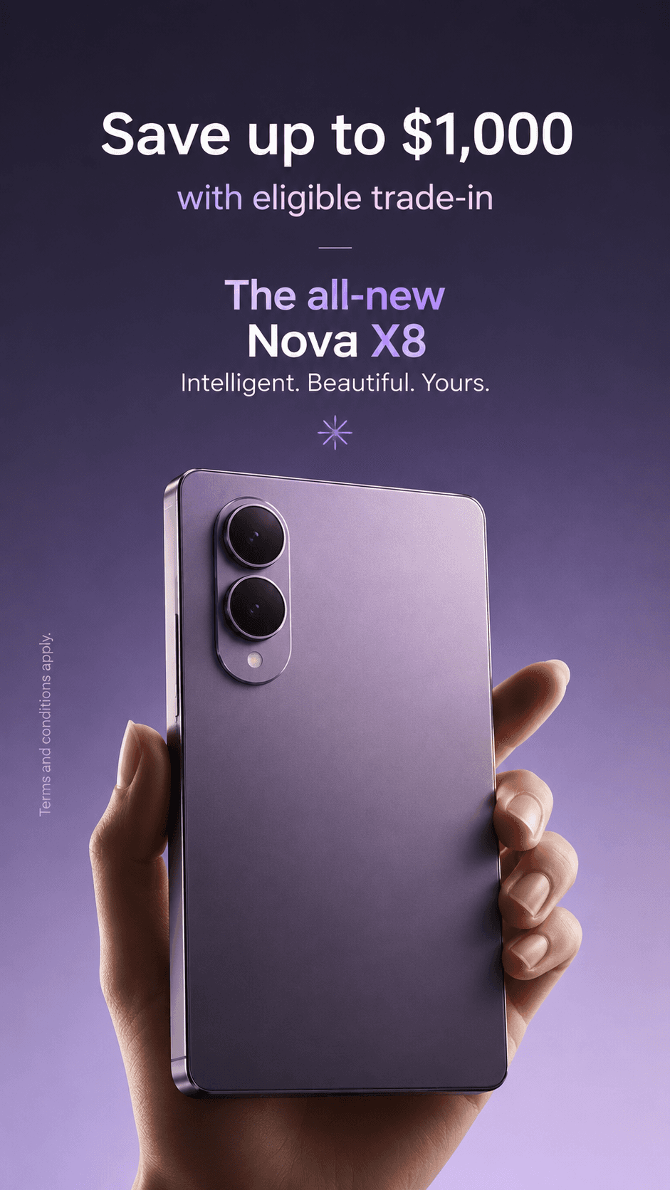
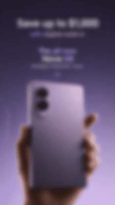
In our experience, the squint test is a powerful way to predict how an asset will perform in the real world. Take this example banner and its resized and blurred version next to it. Blur removes your ability to read so you can focus on the layout and where the attention is drawn.

Banner

Resized and blurred version

Here is a prompt that you can use in ChatGPT or Claude to run the squint test on one of your assets.

You are a seasoned Creative Director running a squint test on a single asset. Resize the attached asset to 25% of its original dimensions and apply a heavy blur so that no text is legible.

Evaluate these in resized and blurred image.

1. Focal point - What wins the eye first, and is there only one?
2. Eye path - Trace the route a viewer takes. Where does it stall?
3. Product visibility - Is the product identifiable without reading?
4. Message clarity - Does the proposition land with zero legible text?
5. Cognitive load - Count the distinct competing elements.

For each, return Pass, Weak, or Fail, with one sentence of reasoning based on what you can see in the blurred version only.

Do not use knowledge of the unblurred asset. If you cannot tell, say you cannot tell.

Here is what ChatGPT had to say about this image.

Criterion

Rating

Reasoning

Focal point

Pass

The eye immediately lands on the large, bright rectangular object in the lower half of the frame. There is a clear dominant focal point with no obvious competitor.

Eye path

Weak

My eyes move from the bright block near the top, down to the phone shape, then stall. There is little visual guidance connecting the upper area to the product beyond simple vertical alignment.

Product visibility

Pass

Although details are lost, it is still recognizable as a handheld smartphone-like device with a distinct camera module.

Message clarity

Fail

I cannot infer the proposition from the blurred composition alone. It is evident that this is an advertisement for a product, but I cannot determine the offer, benefit, or message without readable text.

Cognitive load

Pass

I perceive roughly 4 to 5 competing visual elements: the headline block, the secondary text block, the small central icon, the product, and the hand. That is a manageable number, with one clearly dominant object.


The AI fingerprint test on the same asset

This is a failure mode nobody had to think about before 2023. The arms race of LLMs has given us an abundance of AI models that can generate images and videos blazing fast. However, most of them scream "AI slop" and they are destructive for both short-term conversion and long-term brand equity. This is one of the most important tests you need to run in your crit.

Ironically, AI is a very good judge of other AI. Here is a prompt you can use to detect AI fingerprints.

You are a seasoned Creative Director checking a single asset for AI fingerprints: patterns that make work feel AI-generated rather than designed by an expert human designer.

You are not judging whether AI made this. That question is unanswerable and unhelpful. Human-made work fails these checks too. Judge only whether the composition shows evidence of deliberate choices.

Check each of the following for the attached asset:

1. Centring - Is every element on one vertical axis, or does the layout use an asymmetric grid with intent?
2. Spacing rhythm - Are the gaps between related elements smaller than the gaps between unrelated ones, or is spacing uniform throughout?
3. Scale contrast - Measure the ratio between the largest and smallest type. Under 2:1 across a full hierarchy is a flag.
4. Ground contact - Does the product sit in the scene with a shadow, reflection, or contact point, or does it float?
5. Typography - Is the type a deliberate pairing with a real weight range, or a single family at a single weight, or a default stack?
6. Negative space - Is there any area given deliberately to nothing, or is every region occupied?7. Colour distribution - Is there a dominant, a secondary, and an accent, or is the palette evenly spread with no accent doing work?
8. Imagery specificity - Swap the logo for a competitor's. Would the image still work? If yes, it is generic to the category.
9. Trend currency - Does any treatment belong to a visual convention that peaked more than three years ago?

Rules:

- Judge only what is visible in the attached file. Do not infer intent from the brand.
- For every Fail, cite the specific coordinates, elements, or measurements you based it on.
- If two fails share one underlying cause, say so.
- If you cannot assess a check from this file, say you cannot tell. Do not guess.

Return a table: Fingerprint | Pass, Weak, or Fail | Evidence

This is what Claude said about the above banner.

Fingerprint

Verdict

Evidence

Centring

Fail

All seven display elements sit within 3px of the canvas centre axis. Measured horizontal midpoints: 472.5, 469.5, 470.5, 470.0, 473.5, 471.0, 470.0 against a canvas centre of 470.5. The device is centred too. There is no off-axis decision anywhere in the frame

Spacing rhythm

Pass

Gaps are grouped, not uniform. Within-group spacing runs 19 to 24px (headline to subhead 24px, product name to tagline 21px), between-group spacing runs 42 to 43px either side of the divider rule at y=347. Somebody set that deliberately

Scale contrast

Weak

Overall ratio is fine at roughly 6:1, from the 85px headline band down to the 14px vertical legal line. The problem sits in the middle: the subhead, "The all-new", and "Nova X8" measure 47px, 45px and 49px, a ratio of 1.09:1 across three supposedly different hierarchy levels

Ground contact

Pass

The device is held, with fingers wrapping the left edge and the thumb across the right. Contact is unambiguous. No floating product

Typography

Weak

One family throughout, in at least two weights, differentiated further by colour. Not a default system stack, and not a lazy single weight either. I cannot tell from the file whether this is a licensed brand face or a generic geometric sans, so treat the weak verdict as "no pairing, one family carrying everything" rather than a font identification

Negative space

Pass

Roughly 150px of clear space above the headline, generous margins either side of the device, and the area around the divider rule is given to nothing

Colour distribution

Weak

There is a dominant (purple gradient, RGB 32,28,46 at top to 172,152,209 at bottom), a secondary (white type) and an accent (light violet on the subhead, "The all-new", and the glyph). The accent sits in the same hue family as the background, so it separates by luminance only. The highest-saturation element in the frame is the skin tone of the hand, which nobody chose as an accent

Imagery specificity

Fail

A hand holding a handset against a coloured gradient is the default composition for the category. Replace the wordmark with any competitor and the image works unchanged. Nothing in the photograph is specific to this product beyond the colourway

Trend currency

Pass

Dark gradient with a lit product hero is current. The four-point sparkle glyph belongs to a convention that peaked within the last three years rather than before it. Worth a human look regardless: models date visual conventions unreliably, and the glyph is decorative with no stated job

Building an AI Crit for your own brand

Each of the individual checks of the crit can be built into their own prompts. What matters is grounding the prompt with context about your brand. Here are 6 things to add as context to your AI Crit.

  • Brand book containing colour, logo claims, legal language, accessibility rules, and more

  • Approved assets with annotations about their tier, channel, and audience

  • Industry best practices drawn from competitors, adjacent categories, and winning campaigns

  • Anti-references, meaning work you explicitly rejected or dislike

  • Past feedback pulled from where you collaborate on designs

  • Craft standards such as grid system, type scale, spacing scale, and photography treatment

Testing your AI Crit

Calibrate your AI Crit so you can trust it for every campaign. Here are a few tests you can run.

  1. Run it on the last 20 assets that were approved the first time and the last 20 that came back with comments. The approved set has to score higher.

  2. Run it on 20 competitor assets. It should flag them as off-brand rather than passing them, because passing a competitor's work means it is scoring general design quality and not your brand.

  3. Run it on 20 AI-generated assets. It should catch the fingerprints.

AI Crit out of the box with AI Studio

AI Crit is one of the many tools built into AI Studio that allows us to ship tens of thousands of on-brand assets on time for global brands. We fastidiously measure the first-pass rate, which tells us how many assets were approved by customers without any reviews. Tools like AI Crit help us keep our first-pass rate to above 96%.

Where human expertise comes in

No AI Crit can replace your and your team's taste. A model can tell you an asset looks like every other asset in the category, and it can tell you which of your own approved work it resembles. Whether that sameness is a problem for this campaign, in this quarter, against this competitor, is a judgement that belongs to a person with a name, a job title, and accountability.

The 7 checks buy you the right to spend your judgement on that question instead of on whether the logo is in the safe zone. Brand guardians do not need a machine with opinions. They need everything below the opinion handled, at volume, before the work reaches them.

If your reviews keep uncovering problems that were really brief problems, here is how to craft a brief that works.

Frequently asked questions

What is a design crit?

A design crit is a structured review where designers, copywriters, and Creative Directors evaluate work in progress before it goes out. It differs from an approval in that its purpose is to improve the work rather than to authorise it. The rules are that feedback attacks the work rather than the person, and that every criticism comes with a reason.

Who should give feedback on creative work?

Whoever owns the business outcome makes the final call, usually the brand or channel manager. Everyone else contributes within their area: a creative director on craft and taste, a legal or compliance reviewer on claims, an e-commerce manager on platform specification. The common failure is treating all opinions as equally weighted, which turns a review into a negotiation. Settle who decides what before the first round, not during the third.

How do you review AI-generated designs differently?

The 7 checks stay the same, with one addition. AI-generated assets fail in a way human work rarely does: they pass every objective test and still read as machine-made. Centred layouts, uniform spacing, weak scale contrast, floating products, and interchangeable lifestyle imagery are the usual signals.

What is the squint test?

The squint test means resizing an asset to about 25% and blurring it until no text is legible, then judging what survives. It shows you the focal point, the eye path, product visibility, and message clarity as a scrolling shopper would experience them. It costs little, takes seconds, and catches hierarchy problems that a full-size review hides because the reviewer can read.

How many revision rounds are normal, and what causes them?

Two rounds is a healthy target for a standard adaptation, three for new creative. Most teams run more, and the extra rounds usually trace back to one of two causes: an incomplete brief, or a review that started at craft and only reached brief adherence much later. Both are process problems.

Can AI review creative work?

AI can reliably check the objective layers such as brief coverage, brand rules, platform specifications, asset resolutions, safe zones, and accessibility. It is reasonable at craft when it has been trained on the brand's own approved and rejected work. It is unreliable at taste, and any tool that claims otherwise is scoring general design convention rather than your brand. Treat the output as a first pass that clears the mechanical failures before a person spends attention on the interesting ones.

How is a crit different from an approval?

An approval answers one question: can this ship. A crit answers a longer one: what is wrong with this, how badly, and what would fix it. Teams that only run approvals accumulate the same errors across quarters, because nothing in an approval creates a written standard. A crit produces one every time somebody has to explain why a preference is a preference.

Automate the checklist, keep the judgement

AI Studio runs these checks at scale so your team spends time on taste, not safe zones.

Automate the checklist, keep the judgement

AI Studio runs these checks at scale so your team spends time on taste, not safe zones.

Automate the checklist, keep the judgement

AI Studio runs these checks at scale so your team spends time on taste, not safe zones.

Automate the checklist, keep the judgement

AI Studio runs these checks at scale so your team spends time on taste, not safe zones.