


The font on your hero image or video ad is doing more work than most teams give it credit for. It sets the tone before anyone reads a word. Pick the wrong one and the asset looks off-brand, even if the layout and photography are perfect.
We asked the designers on Rocketium's creative team, the people who build assets for brands like NIVEA, Eucerin and MegaFood every day, which fonts they keep coming back to. Not the trendiest picks. The ones that hold up across ad formats, video timelines, PDP tiles, and social placements.
Key takeaways
|
|---|
Top 10 fonts for product videos and images
1. Bebas
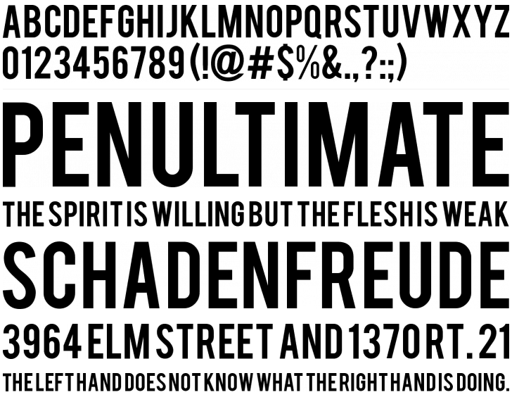
Bebas is a free display font for headlines, captions, and titling, designed by Ryoichi Tsunekawa. It's freeware, so you can use it on commercial and non-commercial work at no cost.
Bebas is the workhorse headline font for a reason. It's tall, condensed, and legible even at small sizes on mobile. If you're producing ecommerce images or video ads with text overlays, this is a safe first choice.
2. Arca Majora
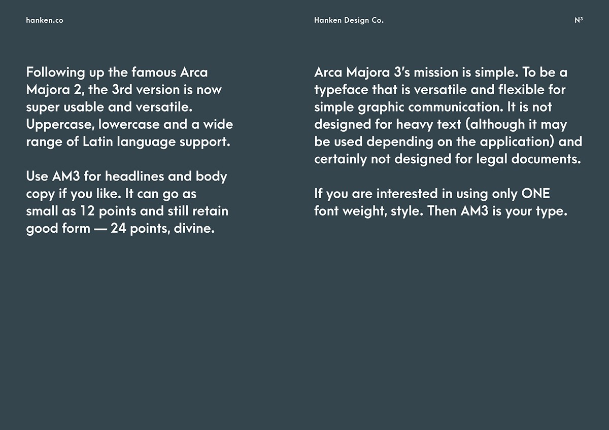
Arca Majora is designed by Alfredo Marco Pradil, a designer based in Dubai, UAE. Sharp tips and bold stems make it a strong pick for high-impact headlines across promo videos, explainer videos, and video ads.
The third version (AM3) added uppercase, lowercase, and wider Latin language support. It works at sizes as small as 12pt, which makes it more flexible than most display fonts.
3. Gilroy Bold
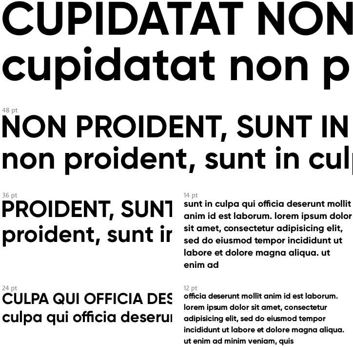
Gilroy Bold is part of the Gilroy family by Radomir Tinkov, a graphic and web designer from Sofia, Bulgaria.
It's a geometric sans-serif that reads clean at every weight. The Bold cut specifically works well for headlines in display ads and social banners where you need presence without heaviness.
4. Helvetica
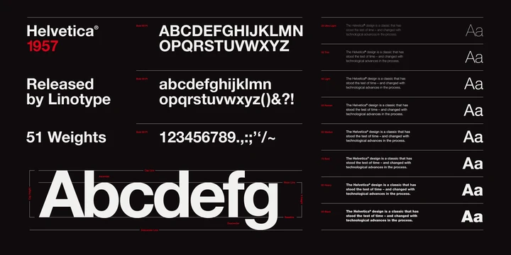
Helvetica was designed by Max Miedinger in 1957. He originally named it Neue Haas Grotesk. In 1983, D. Stempel AG and Linotype redesigned it as Neue Helvetica.
Every creative team knows Helvetica. It's the default for a reason: neutral, legible, and safe across every format. The trade-off is that "safe" can also mean "invisible." If brand distinctiveness matters (and it usually does for brands competing on retailer shelves), consider pairing Helvetica for body text with a more distinctive display font for headlines.
5. Sonder Sans

Designed by Andrew Herndon, a graphic designer from the USA. Sonder is an exploration of vintage lettering, built for logos, advertising headlines, and display.
It adds character that geometric sans-serifs don't. Good for campaigns that need a warmer, more editorial feel, like lifestyle brand video ads or social-first content. Less suited for data-heavy PDP tiles or compliance-sensitive retail formats.
6. Roboto
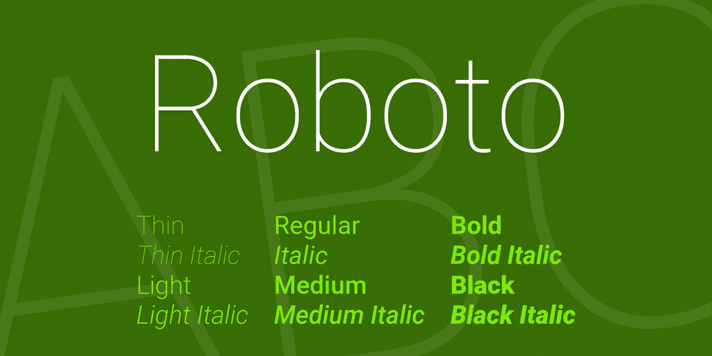
Designed by Christian Robertson. Roboto uses a rigid mechanical skeleton with largely geometric forms, but the curves are friendly and open, which makes it read naturally.
Google designed Roboto for Android, and it's now one of the most widely used web fonts. For creative teams producing assets at scale, its weight range (Thin through Black, with italics for each) gives you enough variation to build an entire campaign's typography system from one family.
7. Lato
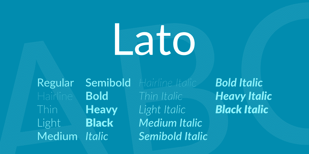
Lato means "summer" in Polish. The typeface family was designed in the summer of 2010 by Łukasz Dziedzic, a designer from Warsaw.
Lato sits in a useful middle ground: warm enough for brand storytelling, structured enough for product information. It's a good pick for A+ content and below-the-fold PDP sections where you need body copy that's approachable but still professional.
8. Quicksand
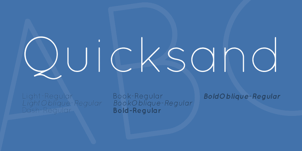
Designed by Andrew Paglinawan. Quicksand was built as a display typeface but stays legible at small sizes too.
The rounded terminals give it a softer feel than most geometric sans-serifs. It works for brands in beauty, wellness, and personal care, categories where the visual tone needs to feel approachable. Less suited for electronics, finance, or categories where you want authority.
9. Cutive Mono
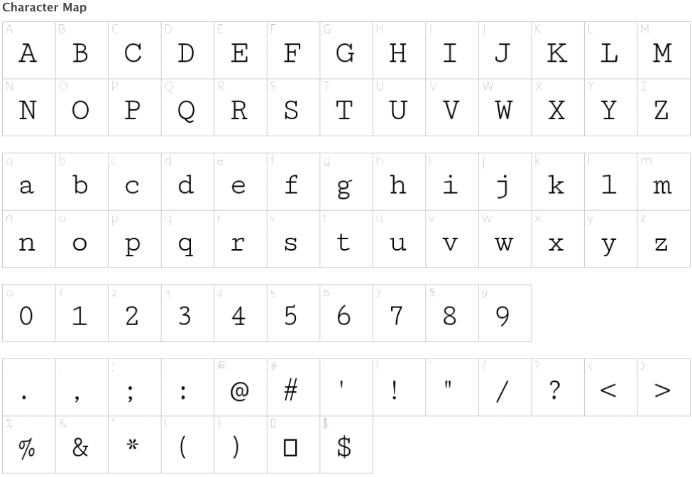
Designed by Vernon Adams. Cutive is based on classic typewriter typefaces, rebuilt as a webfont that works for both body text and display headers.
Monospaced fonts are a deliberate choice: they signal editorial credibility, technical depth, or retro styling. Cutive Mono works for campaign-specific creative directions but is harder to use as your primary brand font across hundreds of assets. Use it where you want a specific mood, not as a default.
10. Proxima Nova
source: marksimonson.com
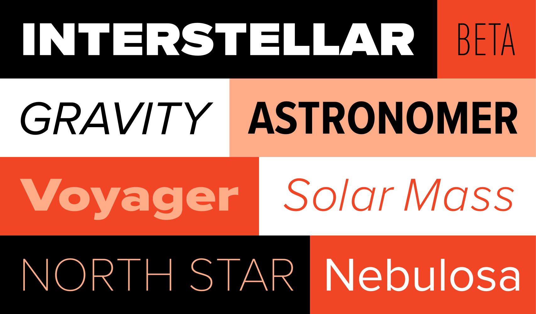
Designed by Mark Simonson. Proxima Nova sits between geometric fonts like Futura and realist fonts like Akzidenz Grotesk.
It's one of the most used commercial fonts on the web for good reason: it reads well at every size, works across headings and body copy, and doesn't fight with product photography. If your brand doesn't have a locked font system yet and you need one font that works everywhere, Proxima Nova is a strong starting point.
How font choice fits into creative production at scale
Picking a good font is the easy part. Keeping it consistent across 50 Amazon PDPs, six retailers, and three ad platforms is where most teams lose time.
Here's what we see across our customer base: the font is rarely the bottleneck at the single-asset level. It becomes a problem when you're producing hundreds of assets and each one needs the right typeface, weight, and size for that specific format and retailer. An Amazon PDP hero image has different text constraints than a Walmart listing tile or a Meta video ad.
AI Studio handles this through design systems and brand governance. Your brand's approved fonts, weights, sizes, and pairing rules are built into the templates. When a designer or AI agent produces a new asset, the typography follows those rules automatically. NIVEA's team, for example, produces assets across 20+ retail platforms with a 0% error rate on brand compliance, including typography.
The other thing worth mentioning: font choice is one of the easiest creative variables to A/B test. If you're already running ad variants, swapping the headline font between two options takes minutes and can shift click-through rates in ways that layout changes sometimes don't. Most teams don't test it because producing the variants takes too long. When production isn't the bottleneck, it becomes a realistic test.
Choosing the right font for your brand
There's no single best font. There's the best font for your audience, your product category, and the platforms you sell on.
A few practical filters:
Start with legibility at your smallest placement. If your font doesn't read cleanly on a mobile PDP tile, it doesn't matter how good it looks in a desktop mockup.
Match the font's personality to your category. Rounded, soft typefaces (Quicksand, Lato) suit wellness and beauty. Geometric and high-contrast fonts (Bebas, Gilroy Bold) suit electronics and performance categories. Neutral workhorses (Roboto, Proxima Nova, Helvetica) suit brands that need to work across many categories.
Test it, don't debate it. Run a font variant test on your next ad campaign. The data will tell you more than any design review meeting.
FAQs
Which font is best for Amazon PDP images?
There is no single best font for Amazon PDPs. Sans-serif fonts with high legibility at small sizes tend to perform best because PDP images are often viewed on mobile at reduced resolution. Bebas, Roboto, and Proxima Nova are strong starting points. The specific best choice depends on your product category and brand guidelines.
Should I use the same font across all my ad platforms?
Consistency helps brand recognition, but some formats require adjustments. A headline font that works on a display banner may need a different weight or size for a video ad end card. The goal is visual consistency, not identical settings across every placement. Lock your font family, then adjust weights and sizes per format.
Are free fonts good enough for commercial ad creative?
Yes, many free fonts are used by major brands. Bebas, Roboto, Lato, and Quicksand are all free and widely used in commercial advertising. The quality gap between free and paid fonts has narrowed significantly. The more relevant question is whether the font supports the weights, styles, and language sets your campaigns need.
How do I keep font usage consistent when producing hundreds of assets?
Build typography rules into your design system or production templates rather than relying on individual designers to remember them. Define the approved font, weights, sizes, and pairing rules once, then enforce them at the template level. This is how teams scaling across multiple retailers and ad platforms maintain consistency without slowing down production.