
11 best fonts for ecommerce: A practical guide to high-converting stores
Claron Kinny
|
Growth
Growth
Growth
Growth
Keep this as a reference. It's the typography guide your team will reach for every time a new product page or storefront redesign ships.
The font on your product page shapes whether a shopper trusts your brand, reads your pricing, or bounces within seconds. Choosing the right fonts for an ecommerce site directly impacts user trust and readability, and getting it wrong quietly erodes revenue.
This post covers the best fonts for ecommerce stores, the principles behind high-converting typography, and how to scale those decisions consistently across every page and creative asset your team produces.
Why font choice can make or break your ecommerce store
Typography significantly affects conversion rates in ecommerce. Our experiments show that changes to body text size, line height, or hierarchy alone can produce 5–15% lifts in conversion. Effective typography enhances readability and establishes visual hierarchy, guiding customers from product title to benefit statement to price to CTA without friction.
Fonts shape the first impression on your homepage and product pages.
When prices are hard to read, CTAs blend into the background, or product descriptions feel cramped, users leave. Approximately 28% of shoppers abandon carts after struggling to read product details, especially on mobile. Poor typography can lead to cart abandonment at a scale most teams never attribute to design.
Ecommerce brands like Amazon, Apple, and Nike treat typography as a core component of their brand assets. Apple’s San Francisco typeface is optimized for screen clarity across every touchpoint. Amazon uses a consistent system of fonts across UI, product detail pages, and support sections to reduce cognitive friction.
From a CreativeOps perspective, typography decisions can’t be treated as one-off tasks. When your team produces thousands of campaign visuals, banners, and product page assets, you need creative automation and brand compliance controls to prevent drift.
That’s why solutions like Rocketium AI Studio enforce approved fonts, sizes, and weights across every template at scale.
Core principles of ecommerce typography
Before selecting specific typefaces, you need a clear understanding of the principles that make ecommerce typography work. Effective typography reduces cognitive load during the shopping experience, helping shoppers find what they need faster.
Legibility first. Readability guidelines suggest body text should start at 16px on desktop and mobile. Anything smaller forces zooming, which disrupts flow. Avoid ultra-thin weights for product names, prices, or checkout forms. Maintain a high contrast ratio between text color and background to prevent eye strain. WCAG requires at least 4.5:1 for normal text and 3:1 for large text. Use contrasting colors to distinguish key information visually.
Clear visual hierarchy. A consistent type scale across headings, body, price, and CTA elements guides the shopper’s eye through the page. Visual hierarchy guides the user’s eye from product title to benefit to price to button. Assign distinct sizes and weights to H1, H2, body text, and metadata so each element has a defined role.
Brand identity alignment. Typography should match brand personality—luxury brands lean toward high-contrast serifs, budget-friendly brands toward clean sans-serifs, playful brands toward rounded geometry. The key trade-off is always personality versus clarity.
Performance. Every font family and weight adds to page load. Limit to two font families and 2–3 weights. Use WOFF2 formats, preload critical fonts, and apply font-display: swap to avoid layout shift. Using web-optimized fonts helps maintain fast site load speeds.
Accessibility. WCAG recommends a line height of at least 1.5 times the font size. Paragraph spacing should be at least 2 times the font size, letter spacing at least 0.12 times the font size, and word spacing at least 0.16 times the font size. Avoid long all-caps paragraphs and ensure fonts remain readable on small mobile screens.
Best font categories for ecommerce (and when to use them)
Not all font categories serve the same function in ecommerce. Here’s when to reach for each:
Sans-serif fonts. These are the default for modern ecommerce UIs. Sans-serif fonts are ideal for digital interfaces due to their legibility at small sizes. Examples include Inter, Roboto, Open Sans, Lato, and Poppins. The right fonts in this category enhance usability and product scanning on ecommerce sites.
Serif fonts. Serif fonts are often reserved for high-end retail or artisanal brand headings. They signal tradition and elegance but carry risks in dense product descriptions. At small sizes on lower-resolution screens, legibility drops. Examples: Playfair Display, Georgia, Merriweather.
Display and decorative fonts. Limit these to logos, hero headlines, and campaign images. They attract attention but fail legibility at smaller sizes. Never use them for body copy or specifications.
Monospaced fonts. Niche use cases only—tech specs, SKU identifiers, or code-oriented brands. They rarely convey the personality needed for general ecommerce.
For most ecommerce stores, the answer is a versatile sans-serif system as the foundation, with an optional serif or display accent strictly limited to headings or storytelling sections.
The font on your product page shapes whether a shopper trusts your brand, reads your pricing, or bounces within seconds. Choosing the right fonts for an ecommerce site directly impacts user trust and readability, and getting it wrong quietly erodes revenue.
This post covers the best fonts for ecommerce stores, the principles behind high-converting typography, and how to scale those decisions consistently across every page and creative asset your team produces.
Why font choice can make or break your ecommerce store
Typography significantly affects conversion rates in ecommerce. Our experiments show that changes to body text size, line height, or hierarchy alone can produce 5–15% lifts in conversion. Effective typography enhances readability and establishes visual hierarchy, guiding customers from product title to benefit statement to price to CTA without friction.
Fonts shape the first impression on your homepage and product pages.
When prices are hard to read, CTAs blend into the background, or product descriptions feel cramped, users leave. Approximately 28% of shoppers abandon carts after struggling to read product details, especially on mobile. Poor typography can lead to cart abandonment at a scale most teams never attribute to design.
Ecommerce brands like Amazon, Apple, and Nike treat typography as a core component of their brand assets. Apple’s San Francisco typeface is optimized for screen clarity across every touchpoint. Amazon uses a consistent system of fonts across UI, product detail pages, and support sections to reduce cognitive friction.
From a CreativeOps perspective, typography decisions can’t be treated as one-off tasks. When your team produces thousands of campaign visuals, banners, and product page assets, you need creative automation and brand compliance controls to prevent drift.
That’s why solutions like Rocketium AI Studio enforce approved fonts, sizes, and weights across every template at scale.
Core principles of ecommerce typography
Before selecting specific typefaces, you need a clear understanding of the principles that make ecommerce typography work. Effective typography reduces cognitive load during the shopping experience, helping shoppers find what they need faster.
Legibility first. Readability guidelines suggest body text should start at 16px on desktop and mobile. Anything smaller forces zooming, which disrupts flow. Avoid ultra-thin weights for product names, prices, or checkout forms. Maintain a high contrast ratio between text color and background to prevent eye strain. WCAG requires at least 4.5:1 for normal text and 3:1 for large text. Use contrasting colors to distinguish key information visually.
Clear visual hierarchy. A consistent type scale across headings, body, price, and CTA elements guides the shopper’s eye through the page. Visual hierarchy guides the user’s eye from product title to benefit to price to button. Assign distinct sizes and weights to H1, H2, body text, and metadata so each element has a defined role.
Brand identity alignment. Typography should match brand personality—luxury brands lean toward high-contrast serifs, budget-friendly brands toward clean sans-serifs, playful brands toward rounded geometry. The key trade-off is always personality versus clarity.
Performance. Every font family and weight adds to page load. Limit to two font families and 2–3 weights. Use WOFF2 formats, preload critical fonts, and apply font-display: swap to avoid layout shift. Using web-optimized fonts helps maintain fast site load speeds.
Accessibility. WCAG recommends a line height of at least 1.5 times the font size. Paragraph spacing should be at least 2 times the font size, letter spacing at least 0.12 times the font size, and word spacing at least 0.16 times the font size. Avoid long all-caps paragraphs and ensure fonts remain readable on small mobile screens.
Best font categories for ecommerce (and when to use them)
Not all font categories serve the same function in ecommerce. Here’s when to reach for each:
Sans-serif fonts. These are the default for modern ecommerce UIs. Sans-serif fonts are ideal for digital interfaces due to their legibility at small sizes. Examples include Inter, Roboto, Open Sans, Lato, and Poppins. The right fonts in this category enhance usability and product scanning on ecommerce sites.
Serif fonts. Serif fonts are often reserved for high-end retail or artisanal brand headings. They signal tradition and elegance but carry risks in dense product descriptions. At small sizes on lower-resolution screens, legibility drops. Examples: Playfair Display, Georgia, Merriweather.
Display and decorative fonts. Limit these to logos, hero headlines, and campaign images. They attract attention but fail legibility at smaller sizes. Never use them for body copy or specifications.
Monospaced fonts. Niche use cases only—tech specs, SKU identifiers, or code-oriented brands. They rarely convey the personality needed for general ecommerce.
For most ecommerce stores, the answer is a versatile sans-serif system as the foundation, with an optional serif or display accent strictly limited to headings or storytelling sections.
Best Sans-Serif fonts for ecommerce stores
Most high-performing ecommerce sites rely on a primary sans-serif family for UI and body text. Effective ecommerce fonts focus on legibility and clean geometry, which is why these free Google Fonts consistently appear on top-converting stores.
Inter. Designed specifically for screen readability with open apertures and a high x-height. Inter was accessed over 414 billion times via Google Fonts in the 12 months ending May 2025. Ideal for tech marketplaces, content-heavy product pages, and any site where clarity is critical. Works best as body text, navigation, and product specs.
Roboto. The default font on Android and many Shopify themes, Roboto is used by nearly 10,000 websites globally. Its mechanical skeleton and open curves make it a strong choice for general retail, electronics, and marketplaces. Suitable for both body and headings when paired with a display accent.
Open Sans. Neutral, friendly, and humanist. Good for fashion, home and living, and beauty brands that want an approachable tone. Widely tested across browsers and devices.
Lato. Balances professionalism and warmth with softer curves. Lato and Merriweather are ideal for readability-focused websites. A strong pick for DTC brands that need corporate credibility without feeling cold.
Montserrat. Geometric and bold, Montserrat works well for banners, hero sections, and headings where you want a strong urban aesthetic. Moderate its use in long paragraphs—its bold shape can overwhelm body text.
Poppins. Rounded, modern, and youthful. Works for cosmetics, lifestyle, and youth-focused ecommerce. Lighter weights can serve as body text, but test carefully at small sizes on mobile.
Each of these typefaces is free to download via Google Fonts and easy to load on modern ecommerce platforms. For deeper recommendations on visual assets, see 10 best fonts designers actually pick for product videos and images.
Best Serif and display fonts to add personality
Serif and display fonts are tools to differentiate your brand identity while preserving usability. High-contrast serif fonts add elegance for luxury ecommerce headings, but they should supplement your sans-serif foundation, not replace it.
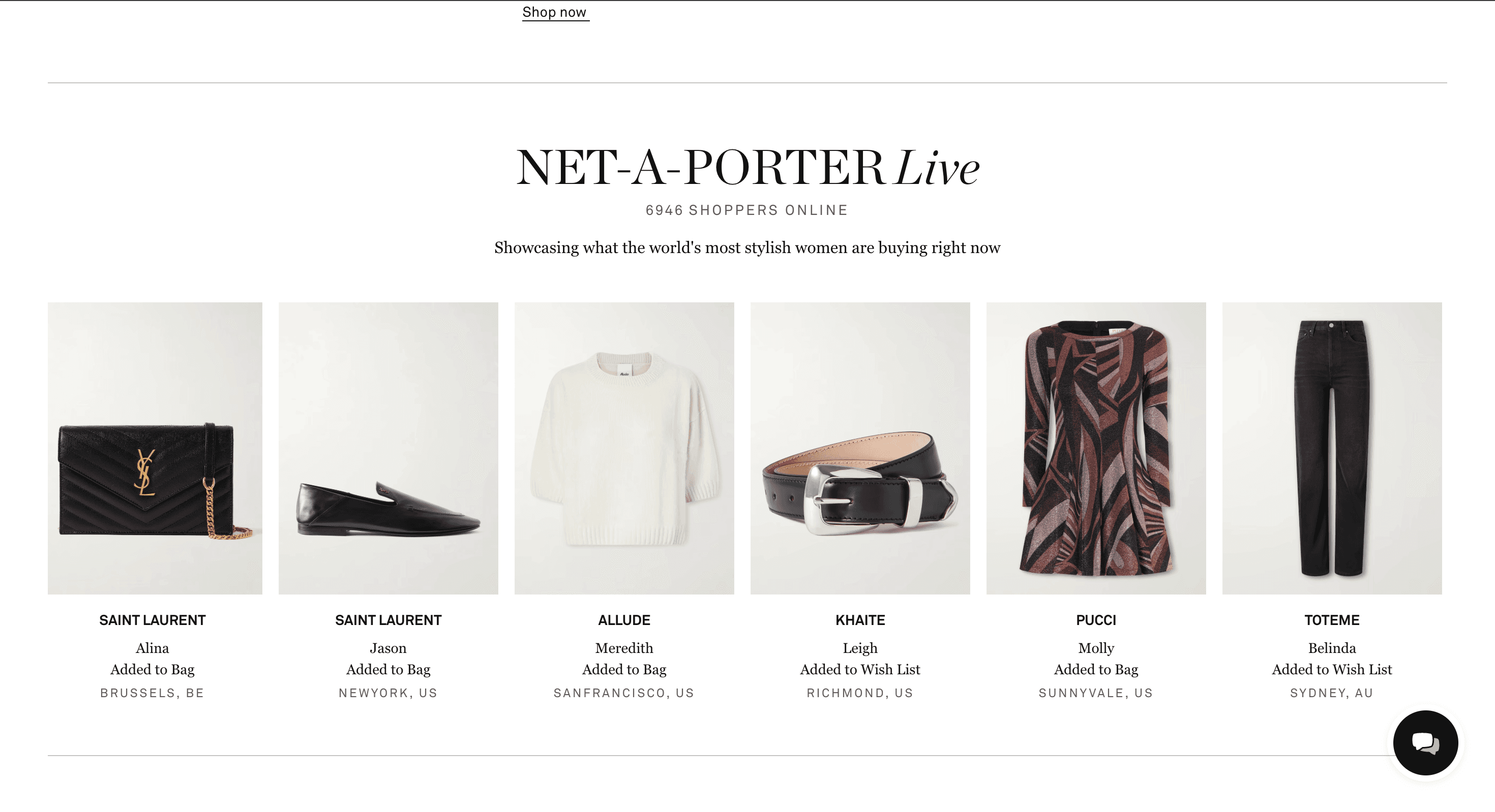
Playfair Display. Ideal for luxury fashion, jewelry, and premium beauty headlines. Its high stroke contrast makes it striking at large sizes but risky in small text on mobile screens. Used effectively by luxury stores like Net-a-Porter.
Merriweather. Designed for screen readability with a robust x-height. Suitable as a body serif for editorial-style blogs, buying guides, and brand story pages.
Libre Baskerville. Good for premium DTC brands that want a classic, trustworthy tone on story pages. Adds gravitas but should be avoided in dense spec sheets.
Abril Fatface. A bold, high-contrast display serif for campaign hero images and sale banners. Its dramatic weight makes it stand out on a page but limits its use to large headlines only.
Cormorant. Refined and delicate, Cormorant suits artisanal, craft, or boutique ecommerce brands in limited headline use. Thin strokes risk legibility on low-contrast backgrounds.
Avoid using these fonts for product descriptions or technical specifications. With creative automation tools like Rocketium, you can enforce limits on where display fonts appear—for example, templates only permit them on hero modules, not product detail text. This prevents the challenge of brand drift across thousands of assets.
Font pairing strategies that work on product pages
Strategic font pairing enhances readability on product pages by creating contrast between different fonts without introducing visual chaos. The core rule: use one font for headings and another for body text. Limit font families to a maximum of two for a clean layout.
The two-font system. One sans-serif handles UI, body text, navigation, and product descriptions. One complementary serif or display font handles H1/H2 headings and hero areas.
Inter (body, navigation, product specs) + Playfair Display (hero and category headings).
Lato (body and UI) + Abril Fatface (campaign headlines). Abril Fatface pairs well with Lato for impactful designs that balance drama and readability.
Roboto (body, buttons) + Montserrat (section headings, price emphasis). A clean, functional pairing for electronics and general retail.
Open Sans (body) + Cormorant (brand story and about pages). Effective when you want to convey heritage on select pages without touching core UI typography.
Hierarchy through size and weight, not just font pairing. H1 at 32–40px, H2 at 24–28px, body text at 16–18px on desktop. A product title should be significantly larger than the product description. Use heavy font weights for calls to action and important buttons to guide user actions.
Typography for high-converting product pages
Product pages are where typography directly impacts revenue. Ads and search traffic often land here first, so every typographic detail matters. Typography guides user attention on product pages, determining whether website visitors convert or leave. Over 60% of ecommerce traffic occurs on mobile devices, which makes responsive typography non-negotiable.
Product titles. Use a clear, larger font size with heavier weight. Avoid overly decorative fonts. Ensure truncation works properly on mobile—word wrap and line breaks should be tested with actual product names, not placeholder text.
Prices and discounts. Price must stand out. Use a strong sans-serif at bold weight with high contrast. For crossed-out original prices, keep them legible but visually secondary. Legibility is crucial for product names, prices, and checkout forms in online shopping.
Features and benefits. Format using bullet lists with sufficient line height and spacing to support quick scanning. WCAG recommends a line height of at least 1.5 times the font size—this applies especially to benefit-focused copy.
Long descriptions on mobile. Keep paragraphs short. Use 1.5–1.8 line height and avoid very light gray text on white backgrounds. Readable product descriptions reduce returns and support questions.
Microcopy and UI text. Shipping info, returns policy, size guides, and stock status badges must stay legible at smaller sizes. Use sans-serif, medium weight, and strong contrast.
With creative automation tools for ecommerce, brands can generate consistent product page creatives—feature callouts, badges, banners—that follow the same typography system without manual effort on each asset.
Aligning fonts with brand identity and assets
Font selection should depend on brand personality and audience for ecommerce. A disruptive DTC brand might choose a sturdy geometric sans-serif. A wellness brand might lean toward a humanist sans-serif. A heritage brand uses serif accents to communicate tradition.
Create a basic brand typography guideline that specifies your primary font, secondary font, permitted weights, sizes, and usage rules for web and product pages. Centralize fonts as reusable brand assets in a design system—Figma tokens, CSS variables, or style libraries—so they propagate across your website, email templates, and ads.
Brand consistency between on-site typography and off-site campaign creatives (banners, videos, display ads) is essential. Without it, customers experience dissonance. Tools like Rocketium help enforce this across thousands of creatives through brand compliance controls. Review competitors’ typography in your niche, then deliberately choose a direction that visually differentiates your shop while staying usable.
Technical and operational considerations (loading, licenses, and scaling)
Typography decisions carry technical weight that web designers and ecommerce teams can’t ignore.
Performance. Each font family and weight increases CSS and asset size. Prefer WOFF2 formats and subset character sets to what you actually need (Latin-only if that’s your market). Responsive typography uses relative units for font sizes. Use CSS clamp() for adaptive font sizes across devices—this ensures responsive typography adapts text for various device sizes without custom media queries for every breakpoint.
Hosting options. Google Fonts offers the simplest setup. Self-hosting gives more control over caching and privacy. Adobe Fonts works if you’re already in that ecosystem. Each option affects load speed differently—test on real pages.
Licensing. Desktop, webfont, and app licenses are different. Many recommended fonts in this post are open-source under SIL Open Font License, which means they’re free for commercial use. But premium display fonts may require paid licenses. Using unlicensed fonts on high-traffic ecommerce sites creates legal risk.
Cross-device testing. Responsive typography ensures readability across all devices, but browser rendering (Chrome vs. Safari vs. Firefox) and OS rendering (Windows ClearType vs. macOS) can make the same font look noticeably different. Test with actual product content on real devices, especially mid-range Android phones where most users shop.
CreativeOps at scale. Rocketium AI Studio stores brand-approved fonts centrally, restricts usage to compliant options, and applies them automatically in templates for ads, product visuals, and landing pages. This is how enterprise teams customize creative output at volume without sacrificing quality or consistency.
How to choose (and stick to) the best font for Your ecommerce brand
Here’s a practical decision sequence to set your ecommerce typography and stick with it:
Define brand personality and target audience. Are you premium, functional, playful, or artisanal? What devices do your customers primarily use?
Choose a primary sans-serif for body and UI from a shortlist (e.g., Inter, Lato, Roboto, Open Sans). This font is your foundation, it handles the heavy lifting across every page on your site.
Add one accent font for headlines if needed (serif or display) that aligns with brand identity. This is where you create differentiation and shape the impression your brand leaves.
Test on real product pages and mobile devices with actual content, not lorem ipsum. Watch session recordings focusing on where users struggle with readability.
Document rules in brand guidelines and encode them in templates. Upload approved fonts to a central library and lock them into your creative workflow.
Run periodic audits of typography across product pages, emails, and ads to catch inconsistencies. Track conversion metrics alongside typography changes to measure impact.
The best fonts for ecommerce are those that balance brand distinctiveness, speed, accessibility, and scalability. Start with a proven sans-serif, add personality where it counts, document the rules, and enforce them at scale.
Rocketium helps teams apply these decisions consistently—across every banner, product image, and campaign creative your business produces.
The font on your product page shapes whether a shopper trusts your brand, reads your pricing, or bounces within seconds. Choosing the right fonts for an ecommerce site directly impacts user trust and readability, and getting it wrong quietly erodes revenue.
This post covers the best fonts for ecommerce stores, the principles behind high-converting typography, and how to scale those decisions consistently across every page and creative asset your team produces.
Why font choice can make or break your ecommerce store
Typography significantly affects conversion rates in ecommerce. Our experiments show that changes to body text size, line height, or hierarchy alone can produce 5–15% lifts in conversion. Effective typography enhances readability and establishes visual hierarchy, guiding customers from product title to benefit statement to price to CTA without friction.
Fonts shape the first impression on your homepage and product pages.
When prices are hard to read, CTAs blend into the background, or product descriptions feel cramped, users leave. Approximately 28% of shoppers abandon carts after struggling to read product details, especially on mobile. Poor typography can lead to cart abandonment at a scale most teams never attribute to design.
Ecommerce brands like Amazon, Apple, and Nike treat typography as a core component of their brand assets. Apple’s San Francisco typeface is optimized for screen clarity across every touchpoint. Amazon uses a consistent system of fonts across UI, product detail pages, and support sections to reduce cognitive friction.
From a CreativeOps perspective, typography decisions can’t be treated as one-off tasks. When your team produces thousands of campaign visuals, banners, and product page assets, you need creative automation and brand compliance controls to prevent drift.
That’s why solutions like Rocketium AI Studio enforce approved fonts, sizes, and weights across every template at scale.
Core principles of ecommerce typography
Before selecting specific typefaces, you need a clear understanding of the principles that make ecommerce typography work. Effective typography reduces cognitive load during the shopping experience, helping shoppers find what they need faster.
Legibility first. Readability guidelines suggest body text should start at 16px on desktop and mobile. Anything smaller forces zooming, which disrupts flow. Avoid ultra-thin weights for product names, prices, or checkout forms. Maintain a high contrast ratio between text color and background to prevent eye strain. WCAG requires at least 4.5:1 for normal text and 3:1 for large text. Use contrasting colors to distinguish key information visually.
Clear visual hierarchy. A consistent type scale across headings, body, price, and CTA elements guides the shopper’s eye through the page. Visual hierarchy guides the user’s eye from product title to benefit to price to button. Assign distinct sizes and weights to H1, H2, body text, and metadata so each element has a defined role.
Brand identity alignment. Typography should match brand personality—luxury brands lean toward high-contrast serifs, budget-friendly brands toward clean sans-serifs, playful brands toward rounded geometry. The key trade-off is always personality versus clarity.
Performance. Every font family and weight adds to page load. Limit to two font families and 2–3 weights. Use WOFF2 formats, preload critical fonts, and apply font-display: swap to avoid layout shift. Using web-optimized fonts helps maintain fast site load speeds.
Accessibility. WCAG recommends a line height of at least 1.5 times the font size. Paragraph spacing should be at least 2 times the font size, letter spacing at least 0.12 times the font size, and word spacing at least 0.16 times the font size. Avoid long all-caps paragraphs and ensure fonts remain readable on small mobile screens.
Best font categories for ecommerce (and when to use them)
Not all font categories serve the same function in ecommerce. Here’s when to reach for each:
Sans-serif fonts. These are the default for modern ecommerce UIs. Sans-serif fonts are ideal for digital interfaces due to their legibility at small sizes. Examples include Inter, Roboto, Open Sans, Lato, and Poppins. The right fonts in this category enhance usability and product scanning on ecommerce sites.
Serif fonts. Serif fonts are often reserved for high-end retail or artisanal brand headings. They signal tradition and elegance but carry risks in dense product descriptions. At small sizes on lower-resolution screens, legibility drops. Examples: Playfair Display, Georgia, Merriweather.
Display and decorative fonts. Limit these to logos, hero headlines, and campaign images. They attract attention but fail legibility at smaller sizes. Never use them for body copy or specifications.
Monospaced fonts. Niche use cases only—tech specs, SKU identifiers, or code-oriented brands. They rarely convey the personality needed for general ecommerce.
For most ecommerce stores, the answer is a versatile sans-serif system as the foundation, with an optional serif or display accent strictly limited to headings or storytelling sections.
Best Sans-Serif fonts for ecommerce stores
Most high-performing ecommerce sites rely on a primary sans-serif family for UI and body text. Effective ecommerce fonts focus on legibility and clean geometry, which is why these free Google Fonts consistently appear on top-converting stores.
Inter. Designed specifically for screen readability with open apertures and a high x-height. Inter was accessed over 414 billion times via Google Fonts in the 12 months ending May 2025. Ideal for tech marketplaces, content-heavy product pages, and any site where clarity is critical. Works best as body text, navigation, and product specs.
Roboto. The default font on Android and many Shopify themes, Roboto is used by nearly 10,000 websites globally. Its mechanical skeleton and open curves make it a strong choice for general retail, electronics, and marketplaces. Suitable for both body and headings when paired with a display accent.
Open Sans. Neutral, friendly, and humanist. Good for fashion, home and living, and beauty brands that want an approachable tone. Widely tested across browsers and devices.
Lato. Balances professionalism and warmth with softer curves. Lato and Merriweather are ideal for readability-focused websites. A strong pick for DTC brands that need corporate credibility without feeling cold.
Montserrat. Geometric and bold, Montserrat works well for banners, hero sections, and headings where you want a strong urban aesthetic. Moderate its use in long paragraphs—its bold shape can overwhelm body text.
Poppins. Rounded, modern, and youthful. Works for cosmetics, lifestyle, and youth-focused ecommerce. Lighter weights can serve as body text, but test carefully at small sizes on mobile.
Each of these typefaces is free to download via Google Fonts and easy to load on modern ecommerce platforms. For deeper recommendations on visual assets, see 10 best fonts designers actually pick for product videos and images.
Best Serif and display fonts to add personality
Serif and display fonts are tools to differentiate your brand identity while preserving usability. High-contrast serif fonts add elegance for luxury ecommerce headings, but they should supplement your sans-serif foundation, not replace it.
Playfair Display. Ideal for luxury fashion, jewelry, and premium beauty headlines. Its high stroke contrast makes it striking at large sizes but risky in small text on mobile screens. Used effectively by luxury stores like Net-a-Porter.
Merriweather. Designed for screen readability with a robust x-height. Suitable as a body serif for editorial-style blogs, buying guides, and brand story pages.
Libre Baskerville. Good for premium DTC brands that want a classic, trustworthy tone on story pages. Adds gravitas but should be avoided in dense spec sheets.
Abril Fatface. A bold, high-contrast display serif for campaign hero images and sale banners. Its dramatic weight makes it stand out on a page but limits its use to large headlines only.
Cormorant. Refined and delicate, Cormorant suits artisanal, craft, or boutique ecommerce brands in limited headline use. Thin strokes risk legibility on low-contrast backgrounds.
Avoid using these fonts for product descriptions or technical specifications. With creative automation tools like Rocketium, you can enforce limits on where display fonts appear—for example, templates only permit them on hero modules, not product detail text. This prevents the challenge of brand drift across thousands of assets.
Font pairing strategies that work on product pages
Strategic font pairing enhances readability on product pages by creating contrast between different fonts without introducing visual chaos. The core rule: use one font for headings and another for body text. Limit font families to a maximum of two for a clean layout.
The two-font system. One sans-serif handles UI, body text, navigation, and product descriptions. One complementary serif or display font handles H1/H2 headings and hero areas.
Inter (body, navigation, product specs) + Playfair Display (hero and category headings).
Lato (body and UI) + Abril Fatface (campaign headlines). Abril Fatface pairs well with Lato for impactful designs that balance drama and readability.
Roboto (body, buttons) + Montserrat (section headings, price emphasis). A clean, functional pairing for electronics and general retail.
Open Sans (body) + Cormorant (brand story and about pages). Effective when you want to convey heritage on select pages without touching core UI typography.
Hierarchy through size and weight, not just font pairing. H1 at 32–40px, H2 at 24–28px, body text at 16–18px on desktop. A product title should be significantly larger than the product description. Use heavy font weights for calls to action and important buttons to guide user actions.
Typography for high-converting product pages
Product pages are where typography directly impacts revenue. Ads and search traffic often land here first, so every typographic detail matters. Typography guides user attention on product pages, determining whether website visitors convert or leave. Over 60% of ecommerce traffic occurs on mobile devices, which makes responsive typography non-negotiable.
Product titles. Use a clear, larger font size with heavier weight. Avoid overly decorative fonts. Ensure truncation works properly on mobile—word wrap and line breaks should be tested with actual product names, not placeholder text.
Prices and discounts. Price must stand out. Use a strong sans-serif at bold weight with high contrast. For crossed-out original prices, keep them legible but visually secondary. Legibility is crucial for product names, prices, and checkout forms in online shopping.
Features and benefits. Format using bullet lists with sufficient line height and spacing to support quick scanning. WCAG recommends a line height of at least 1.5 times the font size—this applies especially to benefit-focused copy.
Long descriptions on mobile. Keep paragraphs short. Use 1.5–1.8 line height and avoid very light gray text on white backgrounds. Readable product descriptions reduce returns and support questions.
Microcopy and UI text. Shipping info, returns policy, size guides, and stock status badges must stay legible at smaller sizes. Use sans-serif, medium weight, and strong contrast.
With creative automation tools for ecommerce, brands can generate consistent product page creatives—feature callouts, badges, banners—that follow the same typography system without manual effort on each asset.
Aligning fonts with brand identity and assets
Font selection should depend on brand personality and audience for ecommerce. A disruptive DTC brand might choose a sturdy geometric sans-serif. A wellness brand might lean toward a humanist sans-serif. A heritage brand uses serif accents to communicate tradition.
Create a basic brand typography guideline that specifies your primary font, secondary font, permitted weights, sizes, and usage rules for web and product pages. Centralize fonts as reusable brand assets in a design system—Figma tokens, CSS variables, or style libraries—so they propagate across your website, email templates, and ads.
Brand consistency between on-site typography and off-site campaign creatives (banners, videos, display ads) is essential. Without it, customers experience dissonance. Tools like Rocketium help enforce this across thousands of creatives through brand compliance controls. Review competitors’ typography in your niche, then deliberately choose a direction that visually differentiates your shop while staying usable.
Technical and operational considerations (loading, licenses, and scaling)
Typography decisions carry technical weight that web designers and ecommerce teams can’t ignore.
Performance. Each font family and weight increases CSS and asset size. Prefer WOFF2 formats and subset character sets to what you actually need (Latin-only if that’s your market). Responsive typography uses relative units for font sizes. Use CSS clamp() for adaptive font sizes across devices—this ensures responsive typography adapts text for various device sizes without custom media queries for every breakpoint.
Hosting options. Google Fonts offers the simplest setup. Self-hosting gives more control over caching and privacy. Adobe Fonts works if you’re already in that ecosystem. Each option affects load speed differently—test on real pages.
Licensing. Desktop, webfont, and app licenses are different. Many recommended fonts in this post are open-source under SIL Open Font License, which means they’re free for commercial use. But premium display fonts may require paid licenses. Using unlicensed fonts on high-traffic ecommerce sites creates legal risk.
Cross-device testing. Responsive typography ensures readability across all devices, but browser rendering (Chrome vs. Safari vs. Firefox) and OS rendering (Windows ClearType vs. macOS) can make the same font look noticeably different. Test with actual product content on real devices, especially mid-range Android phones where most users shop.
CreativeOps at scale. Rocketium AI Studio stores brand-approved fonts centrally, restricts usage to compliant options, and applies them automatically in templates for ads, product visuals, and landing pages. This is how enterprise teams customize creative output at volume without sacrificing quality or consistency.
How to choose (and stick to) the best font for Your ecommerce brand
Here’s a practical decision sequence to set your ecommerce typography and stick with it:
Define brand personality and target audience. Are you premium, functional, playful, or artisanal? What devices do your customers primarily use?
Choose a primary sans-serif for body and UI from a shortlist (e.g., Inter, Lato, Roboto, Open Sans). This font is your foundation, it handles the heavy lifting across every page on your site.
Add one accent font for headlines if needed (serif or display) that aligns with brand identity. This is where you create differentiation and shape the impression your brand leaves.
Test on real product pages and mobile devices with actual content, not lorem ipsum. Watch session recordings focusing on where users struggle with readability.
Document rules in brand guidelines and encode them in templates. Upload approved fonts to a central library and lock them into your creative workflow.
Run periodic audits of typography across product pages, emails, and ads to catch inconsistencies. Track conversion metrics alongside typography changes to measure impact.
The best fonts for ecommerce are those that balance brand distinctiveness, speed, accessibility, and scalability. Start with a proven sans-serif, add personality where it counts, document the rules, and enforce them at scale.
Rocketium helps teams apply these decisions consistently—across every banner, product image, and campaign creative your business produces.
The font on your product page shapes whether a shopper trusts your brand, reads your pricing, or bounces within seconds. Choosing the right fonts for an ecommerce site directly impacts user trust and readability, and getting it wrong quietly erodes revenue.
This post covers the best fonts for ecommerce stores, the principles behind high-converting typography, and how to scale those decisions consistently across every page and creative asset your team produces.
Why font choice can make or break your ecommerce store
Typography significantly affects conversion rates in ecommerce. Our experiments show that changes to body text size, line height, or hierarchy alone can produce 5–15% lifts in conversion. Effective typography enhances readability and establishes visual hierarchy, guiding customers from product title to benefit statement to price to CTA without friction.
Fonts shape the first impression on your homepage and product pages.
When prices are hard to read, CTAs blend into the background, or product descriptions feel cramped, users leave. Approximately 28% of shoppers abandon carts after struggling to read product details, especially on mobile. Poor typography can lead to cart abandonment at a scale most teams never attribute to design.
Ecommerce brands like Amazon, Apple, and Nike treat typography as a core component of their brand assets. Apple’s San Francisco typeface is optimized for screen clarity across every touchpoint. Amazon uses a consistent system of fonts across UI, product detail pages, and support sections to reduce cognitive friction.
From a CreativeOps perspective, typography decisions can’t be treated as one-off tasks. When your team produces thousands of campaign visuals, banners, and product page assets, you need creative automation and brand compliance controls to prevent drift.
That’s why solutions like Rocketium AI Studio enforce approved fonts, sizes, and weights across every template at scale.
Core principles of ecommerce typography
Before selecting specific typefaces, you need a clear understanding of the principles that make ecommerce typography work. Effective typography reduces cognitive load during the shopping experience, helping shoppers find what they need faster.
Legibility first. Readability guidelines suggest body text should start at 16px on desktop and mobile. Anything smaller forces zooming, which disrupts flow. Avoid ultra-thin weights for product names, prices, or checkout forms. Maintain a high contrast ratio between text color and background to prevent eye strain. WCAG requires at least 4.5:1 for normal text and 3:1 for large text. Use contrasting colors to distinguish key information visually.
Clear visual hierarchy. A consistent type scale across headings, body, price, and CTA elements guides the shopper’s eye through the page. Visual hierarchy guides the user’s eye from product title to benefit to price to button. Assign distinct sizes and weights to H1, H2, body text, and metadata so each element has a defined role.
Brand identity alignment. Typography should match brand personality—luxury brands lean toward high-contrast serifs, budget-friendly brands toward clean sans-serifs, playful brands toward rounded geometry. The key trade-off is always personality versus clarity.
Performance. Every font family and weight adds to page load. Limit to two font families and 2–3 weights. Use WOFF2 formats, preload critical fonts, and apply font-display: swap to avoid layout shift. Using web-optimized fonts helps maintain fast site load speeds.
Accessibility. WCAG recommends a line height of at least 1.5 times the font size. Paragraph spacing should be at least 2 times the font size, letter spacing at least 0.12 times the font size, and word spacing at least 0.16 times the font size. Avoid long all-caps paragraphs and ensure fonts remain readable on small mobile screens.
Best font categories for ecommerce (and when to use them)
Not all font categories serve the same function in ecommerce. Here’s when to reach for each:
Sans-serif fonts. These are the default for modern ecommerce UIs. Sans-serif fonts are ideal for digital interfaces due to their legibility at small sizes. Examples include Inter, Roboto, Open Sans, Lato, and Poppins. The right fonts in this category enhance usability and product scanning on ecommerce sites.
Serif fonts. Serif fonts are often reserved for high-end retail or artisanal brand headings. They signal tradition and elegance but carry risks in dense product descriptions. At small sizes on lower-resolution screens, legibility drops. Examples: Playfair Display, Georgia, Merriweather.
Display and decorative fonts. Limit these to logos, hero headlines, and campaign images. They attract attention but fail legibility at smaller sizes. Never use them for body copy or specifications.
Monospaced fonts. Niche use cases only—tech specs, SKU identifiers, or code-oriented brands. They rarely convey the personality needed for general ecommerce.
For most ecommerce stores, the answer is a versatile sans-serif system as the foundation, with an optional serif or display accent strictly limited to headings or storytelling sections.
Best Sans-Serif fonts for ecommerce stores
Most high-performing ecommerce sites rely on a primary sans-serif family for UI and body text. Effective ecommerce fonts focus on legibility and clean geometry, which is why these free Google Fonts consistently appear on top-converting stores.
Inter. Designed specifically for screen readability with open apertures and a high x-height. Inter was accessed over 414 billion times via Google Fonts in the 12 months ending May 2025. Ideal for tech marketplaces, content-heavy product pages, and any site where clarity is critical. Works best as body text, navigation, and product specs.
Roboto. The default font on Android and many Shopify themes, Roboto is used by nearly 10,000 websites globally. Its mechanical skeleton and open curves make it a strong choice for general retail, electronics, and marketplaces. Suitable for both body and headings when paired with a display accent.
Open Sans. Neutral, friendly, and humanist. Good for fashion, home and living, and beauty brands that want an approachable tone. Widely tested across browsers and devices.
Lato. Balances professionalism and warmth with softer curves. Lato and Merriweather are ideal for readability-focused websites. A strong pick for DTC brands that need corporate credibility without feeling cold.
Montserrat. Geometric and bold, Montserrat works well for banners, hero sections, and headings where you want a strong urban aesthetic. Moderate its use in long paragraphs—its bold shape can overwhelm body text.
Poppins. Rounded, modern, and youthful. Works for cosmetics, lifestyle, and youth-focused ecommerce. Lighter weights can serve as body text, but test carefully at small sizes on mobile.
Each of these typefaces is free to download via Google Fonts and easy to load on modern ecommerce platforms. For deeper recommendations on visual assets, see 10 best fonts designers actually pick for product videos and images.
Best Serif and display fonts to add personality
Serif and display fonts are tools to differentiate your brand identity while preserving usability. High-contrast serif fonts add elegance for luxury ecommerce headings, but they should supplement your sans-serif foundation, not replace it.
Playfair Display. Ideal for luxury fashion, jewelry, and premium beauty headlines. Its high stroke contrast makes it striking at large sizes but risky in small text on mobile screens. Used effectively by luxury stores like Net-a-Porter.
Merriweather. Designed for screen readability with a robust x-height. Suitable as a body serif for editorial-style blogs, buying guides, and brand story pages.
Libre Baskerville. Good for premium DTC brands that want a classic, trustworthy tone on story pages. Adds gravitas but should be avoided in dense spec sheets.
Abril Fatface. A bold, high-contrast display serif for campaign hero images and sale banners. Its dramatic weight makes it stand out on a page but limits its use to large headlines only.
Cormorant. Refined and delicate, Cormorant suits artisanal, craft, or boutique ecommerce brands in limited headline use. Thin strokes risk legibility on low-contrast backgrounds.
Avoid using these fonts for product descriptions or technical specifications. With creative automation tools like Rocketium, you can enforce limits on where display fonts appear—for example, templates only permit them on hero modules, not product detail text. This prevents the challenge of brand drift across thousands of assets.
Font pairing strategies that work on product pages
Strategic font pairing enhances readability on product pages by creating contrast between different fonts without introducing visual chaos. The core rule: use one font for headings and another for body text. Limit font families to a maximum of two for a clean layout.
The two-font system. One sans-serif handles UI, body text, navigation, and product descriptions. One complementary serif or display font handles H1/H2 headings and hero areas.
Inter (body, navigation, product specs) + Playfair Display (hero and category headings).
Lato (body and UI) + Abril Fatface (campaign headlines). Abril Fatface pairs well with Lato for impactful designs that balance drama and readability.
Roboto (body, buttons) + Montserrat (section headings, price emphasis). A clean, functional pairing for electronics and general retail.
Open Sans (body) + Cormorant (brand story and about pages). Effective when you want to convey heritage on select pages without touching core UI typography.
Hierarchy through size and weight, not just font pairing. H1 at 32–40px, H2 at 24–28px, body text at 16–18px on desktop. A product title should be significantly larger than the product description. Use heavy font weights for calls to action and important buttons to guide user actions.
Typography for high-converting product pages
Product pages are where typography directly impacts revenue. Ads and search traffic often land here first, so every typographic detail matters. Typography guides user attention on product pages, determining whether website visitors convert or leave. Over 60% of ecommerce traffic occurs on mobile devices, which makes responsive typography non-negotiable.
Product titles. Use a clear, larger font size with heavier weight. Avoid overly decorative fonts. Ensure truncation works properly on mobile—word wrap and line breaks should be tested with actual product names, not placeholder text.
Prices and discounts. Price must stand out. Use a strong sans-serif at bold weight with high contrast. For crossed-out original prices, keep them legible but visually secondary. Legibility is crucial for product names, prices, and checkout forms in online shopping.
Features and benefits. Format using bullet lists with sufficient line height and spacing to support quick scanning. WCAG recommends a line height of at least 1.5 times the font size—this applies especially to benefit-focused copy.
Long descriptions on mobile. Keep paragraphs short. Use 1.5–1.8 line height and avoid very light gray text on white backgrounds. Readable product descriptions reduce returns and support questions.
Microcopy and UI text. Shipping info, returns policy, size guides, and stock status badges must stay legible at smaller sizes. Use sans-serif, medium weight, and strong contrast.
With creative automation tools for ecommerce, brands can generate consistent product page creatives—feature callouts, badges, banners—that follow the same typography system without manual effort on each asset.
Aligning fonts with brand identity and assets
Font selection should depend on brand personality and audience for ecommerce. A disruptive DTC brand might choose a sturdy geometric sans-serif. A wellness brand might lean toward a humanist sans-serif. A heritage brand uses serif accents to communicate tradition.
Create a basic brand typography guideline that specifies your primary font, secondary font, permitted weights, sizes, and usage rules for web and product pages. Centralize fonts as reusable brand assets in a design system—Figma tokens, CSS variables, or style libraries—so they propagate across your website, email templates, and ads.
Brand consistency between on-site typography and off-site campaign creatives (banners, videos, display ads) is essential. Without it, customers experience dissonance. Tools like Rocketium help enforce this across thousands of creatives through brand compliance controls. Review competitors’ typography in your niche, then deliberately choose a direction that visually differentiates your shop while staying usable.
Technical and operational considerations (loading, licenses, and scaling)
Typography decisions carry technical weight that web designers and ecommerce teams can’t ignore.
Performance. Each font family and weight increases CSS and asset size. Prefer WOFF2 formats and subset character sets to what you actually need (Latin-only if that’s your market). Responsive typography uses relative units for font sizes. Use CSS clamp() for adaptive font sizes across devices—this ensures responsive typography adapts text for various device sizes without custom media queries for every breakpoint.
Hosting options. Google Fonts offers the simplest setup. Self-hosting gives more control over caching and privacy. Adobe Fonts works if you’re already in that ecosystem. Each option affects load speed differently—test on real pages.
Licensing. Desktop, webfont, and app licenses are different. Many recommended fonts in this post are open-source under SIL Open Font License, which means they’re free for commercial use. But premium display fonts may require paid licenses. Using unlicensed fonts on high-traffic ecommerce sites creates legal risk.
Cross-device testing. Responsive typography ensures readability across all devices, but browser rendering (Chrome vs. Safari vs. Firefox) and OS rendering (Windows ClearType vs. macOS) can make the same font look noticeably different. Test with actual product content on real devices, especially mid-range Android phones where most users shop.
CreativeOps at scale. Rocketium AI Studio stores brand-approved fonts centrally, restricts usage to compliant options, and applies them automatically in templates for ads, product visuals, and landing pages. This is how enterprise teams customize creative output at volume without sacrificing quality or consistency.
How to choose (and stick to) the best font for Your ecommerce brand
Here’s a practical decision sequence to set your ecommerce typography and stick with it:
Define brand personality and target audience. Are you premium, functional, playful, or artisanal? What devices do your customers primarily use?
Choose a primary sans-serif for body and UI from a shortlist (e.g., Inter, Lato, Roboto, Open Sans). This font is your foundation, it handles the heavy lifting across every page on your site.
Add one accent font for headlines if needed (serif or display) that aligns with brand identity. This is where you create differentiation and shape the impression your brand leaves.
Test on real product pages and mobile devices with actual content, not lorem ipsum. Watch session recordings focusing on where users struggle with readability.
Document rules in brand guidelines and encode them in templates. Upload approved fonts to a central library and lock them into your creative workflow.
Run periodic audits of typography across product pages, emails, and ads to catch inconsistencies. Track conversion metrics alongside typography changes to measure impact.
The best fonts for ecommerce are those that balance brand distinctiveness, speed, accessibility, and scalability. Start with a proven sans-serif, add personality where it counts, document the rules, and enforce them at scale.
Rocketium helps teams apply these decisions consistently—across every banner, product image, and campaign creative your business produces.
Best Sans-Serif fonts for ecommerce stores
Most high-performing ecommerce sites rely on a primary sans-serif family for UI and body text. Effective ecommerce fonts focus on legibility and clean geometry, which is why these free Google Fonts consistently appear on top-converting stores.
Inter. Designed specifically for screen readability with open apertures and a high x-height. Inter was accessed over 414 billion times via Google Fonts in the 12 months ending May 2025. Ideal for tech marketplaces, content-heavy product pages, and any site where clarity is critical. Works best as body text, navigation, and product specs.
Roboto. The default font on Android and many Shopify themes, Roboto is used by nearly 10,000 websites globally. Its mechanical skeleton and open curves make it a strong choice for general retail, electronics, and marketplaces. Suitable for both body and headings when paired with a display accent.
Open Sans. Neutral, friendly, and humanist. Good for fashion, home and living, and beauty brands that want an approachable tone. Widely tested across browsers and devices.
Lato. Balances professionalism and warmth with softer curves. Lato and Merriweather are ideal for readability-focused websites. A strong pick for DTC brands that need corporate credibility without feeling cold.
Montserrat. Geometric and bold, Montserrat works well for banners, hero sections, and headings where you want a strong urban aesthetic. Moderate its use in long paragraphs—its bold shape can overwhelm body text.
Poppins. Rounded, modern, and youthful. Works for cosmetics, lifestyle, and youth-focused ecommerce. Lighter weights can serve as body text, but test carefully at small sizes on mobile.
Each of these typefaces is free to download via Google Fonts and easy to load on modern ecommerce platforms. For deeper recommendations on visual assets, see 10 best fonts designers actually pick for product videos and images.
Best Serif and display fonts to add personality
Serif and display fonts are tools to differentiate your brand identity while preserving usability. High-contrast serif fonts add elegance for luxury ecommerce headings, but they should supplement your sans-serif foundation, not replace it.
Playfair Display. Ideal for luxury fashion, jewelry, and premium beauty headlines. Its high stroke contrast makes it striking at large sizes but risky in small text on mobile screens. Used effectively by luxury stores like Net-a-Porter.
Merriweather. Designed for screen readability with a robust x-height. Suitable as a body serif for editorial-style blogs, buying guides, and brand story pages.
Libre Baskerville. Good for premium DTC brands that want a classic, trustworthy tone on story pages. Adds gravitas but should be avoided in dense spec sheets.
Abril Fatface. A bold, high-contrast display serif for campaign hero images and sale banners. Its dramatic weight makes it stand out on a page but limits its use to large headlines only.
Cormorant. Refined and delicate, Cormorant suits artisanal, craft, or boutique ecommerce brands in limited headline use. Thin strokes risk legibility on low-contrast backgrounds.
Avoid using these fonts for product descriptions or technical specifications. With creative automation tools like Rocketium, you can enforce limits on where display fonts appear—for example, templates only permit them on hero modules, not product detail text. This prevents the challenge of brand drift across thousands of assets.
Font pairing strategies that work on product pages
Strategic font pairing enhances readability on product pages by creating contrast between different fonts without introducing visual chaos. The core rule: use one font for headings and another for body text. Limit font families to a maximum of two for a clean layout.
The two-font system. One sans-serif handles UI, body text, navigation, and product descriptions. One complementary serif or display font handles H1/H2 headings and hero areas.
Inter (body, navigation, product specs) + Playfair Display (hero and category headings).
Lato (body and UI) + Abril Fatface (campaign headlines). Abril Fatface pairs well with Lato for impactful designs that balance drama and readability.
Roboto (body, buttons) + Montserrat (section headings, price emphasis). A clean, functional pairing for electronics and general retail.
Open Sans (body) + Cormorant (brand story and about pages). Effective when you want to convey heritage on select pages without touching core UI typography.
Hierarchy through size and weight, not just font pairing. H1 at 32–40px, H2 at 24–28px, body text at 16–18px on desktop. A product title should be significantly larger than the product description. Use heavy font weights for calls to action and important buttons to guide user actions.
Typography for high-converting product pages
Product pages are where typography directly impacts revenue. Ads and search traffic often land here first, so every typographic detail matters. Typography guides user attention on product pages, determining whether website visitors convert or leave. Over 60% of ecommerce traffic occurs on mobile devices, which makes responsive typography non-negotiable.
Product titles. Use a clear, larger font size with heavier weight. Avoid overly decorative fonts. Ensure truncation works properly on mobile—word wrap and line breaks should be tested with actual product names, not placeholder text.
Prices and discounts. Price must stand out. Use a strong sans-serif at bold weight with high contrast. For crossed-out original prices, keep them legible but visually secondary. Legibility is crucial for product names, prices, and checkout forms in online shopping.
Features and benefits. Format using bullet lists with sufficient line height and spacing to support quick scanning. WCAG recommends a line height of at least 1.5 times the font size—this applies especially to benefit-focused copy.
Long descriptions on mobile. Keep paragraphs short. Use 1.5–1.8 line height and avoid very light gray text on white backgrounds. Readable product descriptions reduce returns and support questions.
Microcopy and UI text. Shipping info, returns policy, size guides, and stock status badges must stay legible at smaller sizes. Use sans-serif, medium weight, and strong contrast.
With creative automation tools for ecommerce, brands can generate consistent product page creatives—feature callouts, badges, banners—that follow the same typography system without manual effort on each asset.

Rocketium AI Studio helps teams apply fonts consistently across every banner, product image, and campaign creative your business produces.
Rocketium AI Studio helps teams apply fonts consistently across every banner, product image, and campaign creative your business produces.
Rocketium AI Studio helps teams apply fonts consistently across every banner, product image, and campaign creative your business produces.
Rocketium AI Studio helps teams apply fonts consistently across every banner, product image, and campaign creative your business produces.