
8 Amazon Brand Store design best practices with examples
Playbook
Claron Kinny
|
Growth & Content
Reviewed by Satej Sirur, Co-founder & CEO
An Amazon Brand Store gives you something individual product listings cannot: a space to merchandise an assortment as a brand rather than as isolated SKUs.
Amazon lets brands combine product collections, lifestyle imagery, video, text, and dedicated pages inside a multi-page shopping experience. Creating and maintaining a Brand Store is free, and shoppers can reach it through product-page brand bylines, Amazon search, ads, or a direct Store URL.
That makes Amazon Brand Store design less like designing a banner and more like designing a small ecommerce experience.
A shopper still needs to answer familiar questions:
Am I looking at the right brand? Where is the product I need? What's different between these options? Why should I choose this one? What do I click next? |
The best Store designs answer those questions without making shoppers work for them.
Amazon reports that shoppers who visit a Brand Store during their journey purchase 53.9% more frequently and have a 71.3% higher average order value than shoppers who do not.
Key takeaways
|
|---|
Here are eight Amazon Brand Store design practices worth applying, with real storefronts showing what each one looks like in practice.
1. Build the homepage around product discovery
The homepage has to establish the brand, but its more important job is to help shoppers decide where to go next.
Brand teams naturally gravitate toward the biggest canvas available. A homepage becomes a hero campaign, a mission statement, a film, three awards, a founder story, and eventually the products disappear below several screens of brand content.
An Amazon shopper is usually closer to a purchase than someone casually visiting your corporate site. Give the brand enough room to establish itself, then make the assortment obvious.
A useful homepage hierarchy is:
Brand/value proposition
Major shopping paths
Priority or best-selling products
Product education
Additional brand storytelling
Amazon itself recommends organizing Store content around customer-friendly groupings such as category, product type, use, need, or theme rather than simply recreating an internal catalogue structure.
Amazon Brand Store example: Dyson
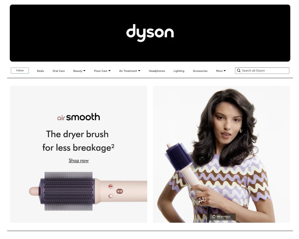
Dyson is a useful example because it has a difficult merchandising problem: vacuums, hair-care products, air-treatment products, headphones, and accessories belong to the same brand but solve very different problems.
View the live Dyson Amazon Store
Its Amazon Brand Store uses category structure, strong imagery, explicit value propositions, and video to keep those product families distinct while still feeling like one Dyson experience.
What to borrow: Don't force shoppers to understand your product taxonomy. Make the first decision obvious: What are you here to shop for?
2. Organize navigation around how customers choose
Navigation labels are small pieces of copy with disproportionate influence over the Store experience.
"Products," "Solutions," or an internal portfolio name may make perfect sense to your team and still tell a first-time shopper almost nothing.
A better question is: What distinction does the shopper already have in their head?
Depending on the category, that may be:
Product type
Use case
Concern
Recipient
Collection
Size
Activity
Product generation
For skincare, someone may shop by concern. For electronics, they may shop by device or use case. For drinkware, they may already know whether they want bottles, tumblers, coolers, or accessories.
Amazon Brand Store example: The Ordinary
The Ordinary is particularly useful here because skincare can become difficult to navigate quickly. Shoppers do not necessarily arrive thinking in terms of a brand's internal product families. They may be trying to solve dryness, congestion, signs of ageing, or another concern.
The brand's Amazon presence is a strong reference for benefit- and concern-oriented product discovery rather than forcing every shopper to decode ingredient categories first. The Store launched officially within Amazon Premium Beauty in 2025 and remains an active Amazon destination.

What to borrow: When customers describe the problem differently from the way your catalogue is organized, navigation should usually follow the customer.
That does not mean every Store needs "shop by concern." The principle is broader: navigation should reflect buying logic, not the org chart.
3. Make brand storytelling lead somewhere shoppable
Brand storytelling and conversion are not opposing goals.
The mistake is treating them as separate sections of the Store: first several screens of "brand," then suddenly a wall of products.
Stronger Amazon storefront design alternates between the two. A video creates desire. A product module gives that desire somewhere to go.
Lifestyle imagery supplies context. A shoppable image lets the customer identify the exact products involved.
A product-benefit section explains why something matters. The next module lets the shopper compare or buy it.
Amazon Brand Store example: Peloton
Peloton is a clear example of why motion can work when the product itself is experiential.
A static photograph can show a Bike. Video can show the product in use, the screen experience, movement, and the atmosphere Peloton sells around the hardware.
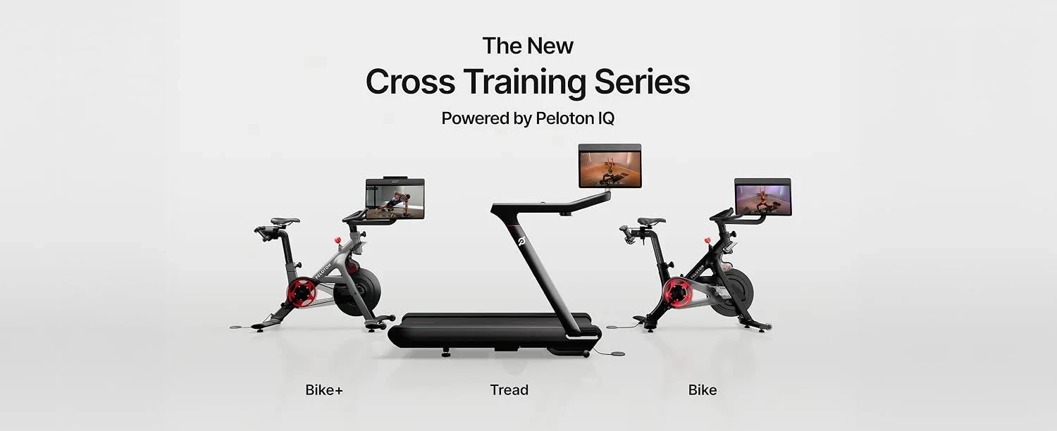
The Store then brings shoppers back toward clear categories and products rather than allowing the video to become an isolated brand film.
View the live Peloton Amazon Store
What to borrow: Every storytelling module should earn the next click.
If your hero communicates aspiration, the section immediately below it should make the next shopping action obvious.
4. Design Amazon Store creative around Amazon's actual constraints
This is where Amazon Brand Store design stops being purely subjective. Amazon publishes concrete creative requirements, and ignoring them can turn a strong master design into a weak live experience.
Amazon Store hero images need a protected safe zone
Amazon currently specifies a minimum hero-image size of 3,000 × 600 pixels.
More importantly, Amazon warns that as much as 30% of a hero image can be cropped-15% from each side depending on the device. Vital text, logos, products, or claims therefore need to remain in the central safe zone.
A designer may naturally place a headline or product toward an edge to create visual tension. On an Amazon Store, that composition needs to survive Amazon's cropping behavior first.
Link titles can cover image content
If you add a link title to an image tile, Amazon overlays part of that tile:
Store creative element | Current Amazon guidance | Design implication |
|---|---|---|
Hero image | Minimum 3,000 × 600 px | Keep essential content inside the central safe zone |
Hero crop | Up to 15% from each side | Treat outer areas as expendable |
Rectangular image tile with link title | ~19% obscured at bottom | Keep products and baked-in text away from the bottom fifth |
Square image tile with link title | ~12% obscured at bottom | Protect the lower section |
Mobile image tiles | Custom mobile image/layout supported | Review mobile intentionally rather than trusting the desktop crop |
Amazon documents all of these requirements in its current Store creative specifications.
Review Amazon's current Brand Store creative guidelines
5. Treat mobile as a design decision, not a QA checkbox
Desktop screenshots make Amazon Stores look generous. Mobile makes every hierarchy decision visible.
Wide heroes become narrower. Type gets smaller. Category options stack. Shoppers see fewer modules simultaneously. Details that looked obvious on a large preview suddenly compete for attention.
Amazon's Store Builder supports custom mobile images and layouts for image tiles. It also warns that certain text fields are not supported with custom mobile layouts and may only appear to desktop shoppers.
So "responsive" should not mean "we checked it after desktop approval."
For important modules:
Decide what must remain visible on a phone.
Reframe the product rather than simply shrinking the desktop crop.
Increase text legibility.
Remove decorative detail that does not survive smaller sizes.
Check where overlays and Amazon UI elements sit.
Preview the complete path from Store to PDP.
Amazon Brand Store example: Hydro Flask
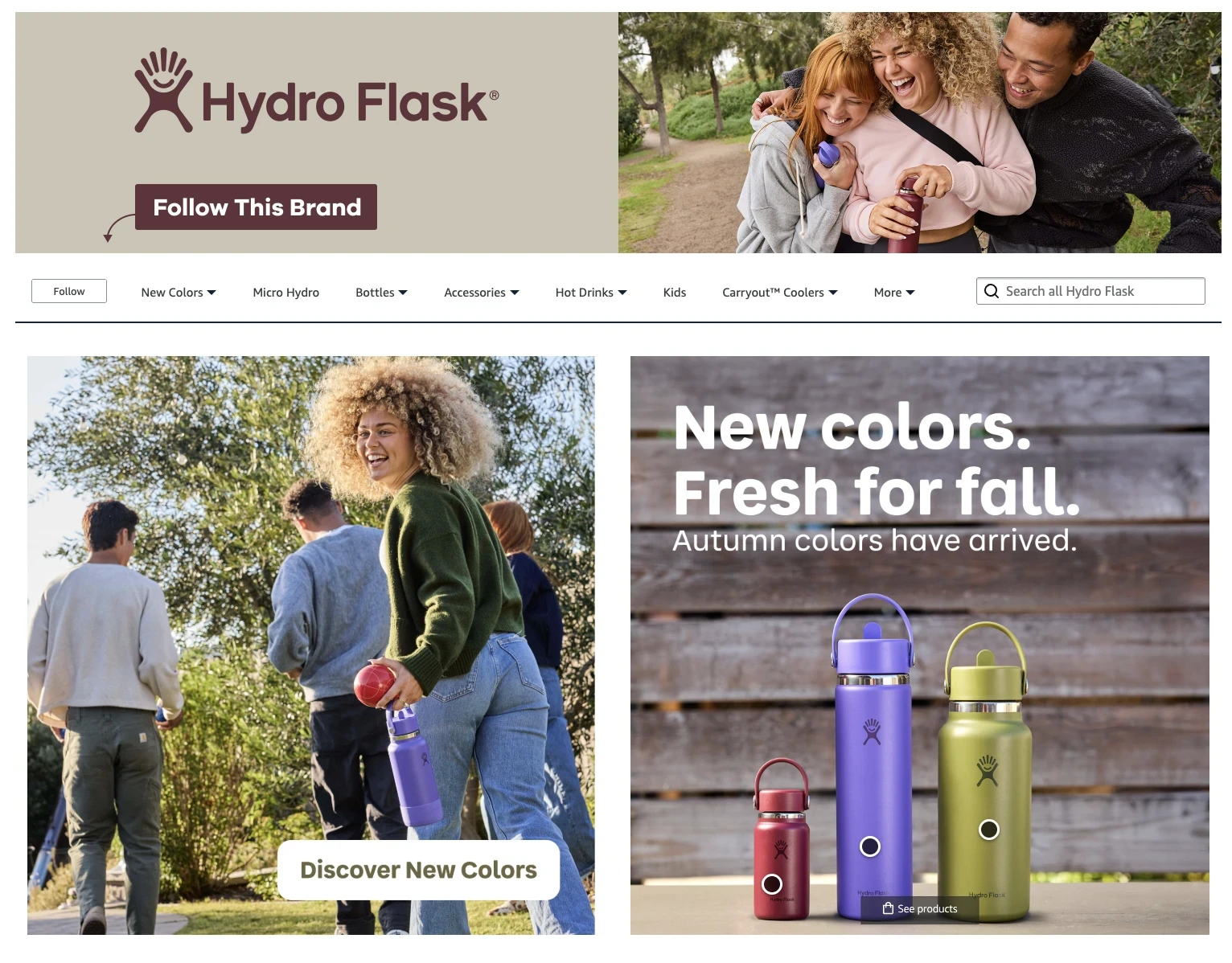
Hydro Flask is a useful reference because its Store has to handle both strong lifestyle photography and a broad assortment.
The design uses product-focused imagery and clearly differentiated shopping paths without allowing the energetic brand photography to overwhelm navigation.
View the live Hydro Flask Amazon Store
What to borrow: Product imagery can carry personality without forcing navigation to become equally expressive.
For mobile especially, keep the visual system distinctive and the interaction model boring, in the best sense of the word.
6. Use education where it removes a buying barrier
Product education deserves space when it answers a question that might otherwise send a shopper back to Amazon search.
That distinction is important, as more educational content is not automatically better Store design.
The useful questions are closer to:
Which model is right for me?
What's the difference between these products?
What does this technology do?
How do I use it?
What size do I need?
Why does this product cost more?
Which product fits my use case?
This is where comparison modules, feature explanations, demonstration videos, ingredient education, credentials, or use-case content can make the Amazon brand store more useful rather than simply longer.
Amazon Brand Store example: Oura
Oura has a category where product education matters because buyers need to understand the device, generations, features, sizing, and health-related use cases before choosing.
Its Store is a useful reference for combining premium imagery with comparison and education instead of assuming aesthetics alone will close a relatively considered purchase.
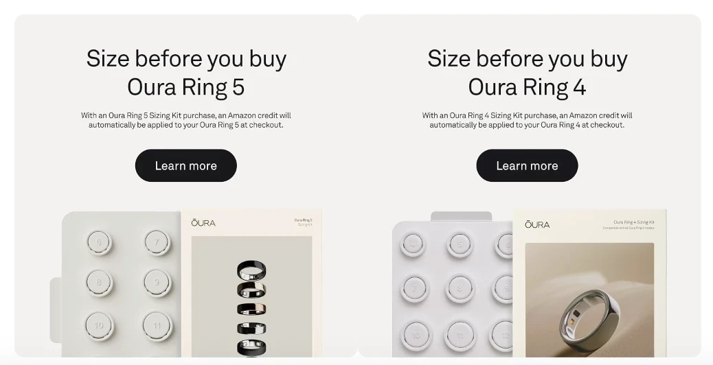
What to borrow: Use content to remove uncertainty immediately before the relevant shopping decision.
For brands with closely related SKUs, a well-built comparison section may do more conversion work than another lifestyle banner.
7. Measure whether the Store structure is working
Once the Store is live, design arguments become testable.
Amazon's Brand Store Insights includes metrics such as visits, page views, sales, and traffic sources. Use them diagnostically.
For example:
What you observe | What to investigate |
|---|---|
Homepage traffic is healthy, but category exploration is low | Category hierarchy, labels, and first-screen routes |
A category receives traffic but weak downstream sales | Product selection, education, or merchandising |
One page gets almost no visits | Whether shoppers understand the navigation label or need the page at all |
New products sell but remain buried in Store navigation | Launch/merchandising workflow |
Mobile experience underperforms | Cropping, text legibility, hierarchy, and module order |
The point is not to redesign every time one metric moves. It is to stop treating Store design as an aesthetic opinion once you have behavioral evidence.
Amazon also recommends keeping Stores current. According to Amazon, Stores updated within the previous 90 days have 11% more repeat visitors and 13% higher attributed sales per visitor on average. Again, that is an observed relationship rather than proof that refreshing a Store automatically causes the lift, but it makes a reasonable case for treating Store maintenance as ongoing work.
8. Build the design system for the tenth refresh, not only launch day
This is the part of Amazon Brand Store design that gets underestimated.
Imagine a Store with one homepage and four important category pages. You already have multiple hero creatives. Then add image tiles, featured-product modules, promotional assets, mobile alternatives, video, seasonal modules, and launches.
Now introduce:
Black Friday
Holiday
A new product family
New pack shots
A claim update
Five additional marketplaces
Localized copy
Mobile variants
The design question has changed.
You are no longer asking, "Can our team design a good Amazon Store?"
You are asking: "Can our creative-production system keep this Store current without turning every update into another design project?"
That is where a repeatable asset system matters.
An approved master should make it easier to produce new versions while preserving hierarchy, safe zones, imagery rules, typography, and platform requirements. It is the same production problem consumer brands encounter across PDPs, A+ content, retail media, and other ecommerce surfaces.
If this is already a bottleneck, our guide to creative versioning for consumer brands helps separate strategic redesign work from repetitive adaptation work.
For teams expanding internationally, the same problem grows again: copy changes, visual requirements change, and finished assets have to be recreated for each market. We cover that workflow in our guide to enterprise creative localization.
Where Rocketium fits into Amazon Store creative production
Rocketium's work starts before production.
Before any asset is made, AI Studio pulls in the context that shapes better creative: audience signals from reviews and social, competitor activity, your brand guidelines, past performance data, and platform-specific rules.
That intelligence feeds directly into briefs, concepts, and copy, not into a separate report your team has to interpret on their own.
Once the direction is set, AI workflows handle the repeatable work: creative versioning, size adaptation, production from approved briefs, platform-compliance checks, and asset taxonomy.
Human experts review and refine every output before it ships. The model joins AI speed with human craft, so what gets delivered has both scale and quality built in.
Your team defines what the Store should say, how products should be organized, and what the master design looks like. The production system then rebuilds approved patterns, creates versions, adapts dimensions, applies product and copy variations, checks output against brand and platform rules, and delivers assets for review.
You don't need to replace your agency, rebuild your team, or change your workflow. Rocketium fits into how you already work, taking on the production and scaling so your team can focus on strategy and merchandising.
For a closer look at the Amazon-specific creative layer, see our Amazon PDP optimization framework.
Amazon Brand Store design checklist
Before the next Amazon Brand Store launch or refresh, review it at three levels.
Shopping experience
Can a new shopper understand your main product categories immediately?
Do navigation labels match how customers actually shop?
Can someone reach the right product or category without unnecessary clicks?
Does education answer actual purchase questions?
Does storytelling eventually lead to a product?
Creative execution
Are essential hero elements inside Amazon's safe zone?
Have linked-tile overlay areas been protected?
Do mobile crops work intentionally?
Is text legible at mobile sizes?
Do product photography, claims, and visual language remain consistent with the PDP?
Production readiness
Is there an approved master system rather than isolated files?
Can seasonal modules be refreshed without redesigning the Store?
Can new SKUs be added quickly?
Are mobile versions part of the brief?
Can the same system handle localization and marketplace expansion?
A good Amazon Brand Store should work on launch day. A good Amazon Brand Store design system should still work six launches later.
Frequently asked questions about Amazon Brand Store design
What is Amazon Brand Store design?
Amazon Brand Store design is the process of structuring and designing a brand's multi-page storefront on Amazon. It includes navigation, product merchandising, hero imagery, image and video modules, educational content, mobile layouts, and the routes shoppers use to reach products.
What makes a good Amazon Brand Store?
A good Amazon Brand Store makes products easy to discover while communicating enough brand and product information to help shoppers choose confidently. Clear navigation, deliberate visual hierarchy, mobile-friendly creative, useful product education, and obvious shoppable paths matter more than decorative complexity.
What size should an Amazon Brand Store hero image be?
Amazon currently specifies a minimum hero-image size of 3,000 × 600 pixels. Amazon also warns that up to 15% can be cropped from each side, so important text, products, and logos should remain inside the central safe zone.
Should Amazon Brand Store design be mobile-first?
Mobile should be treated as a separate design consideration. Amazon allows custom mobile images and layouts for image tiles, and some text fields behave differently when custom mobile layouts are used. Preview important Store pages on both desktop and mobile before publishing.
How often should you update an Amazon Brand Store?
There is no universal schedule, because refreshes should follow launches, campaigns, seasonal changes, assortment updates, and performance data. Amazon reports that Stores updated within the previous 90 days have 11% more repeat visitors and 13% higher attributed sales per visitor on average, making a roughly quarterly review a useful operational benchmark for many brands.
What are some good Amazon Brand Store examples?
Dyson is useful for category architecture, Peloton for video-led storytelling, Hydro Flask for balancing lifestyle and product imagery, The Ordinary for shopper-oriented navigation, and Oura for product education and comparison. The right reference depends on the design problem you are solving rather than which Store looks most impressive.