Updated On:
Written By

" height="20px" id="fXPtLeYUp" width="20px"/></svg>)
Growth Marketer
Reviewed By

Co-founder and CEO

A good Amazon A+ page does not make the product detail page longer for sport.
It earns the scroll.
By the time a shopper reaches A+ Content, they have usually seen the title, hero image, gallery, bullet points, price, ratings, and at least part of the review section. So the A+ section should not behave like a larger version of the gallery. That is where many pages become expensive wallpaper.
The useful pages answer the question the listing has not answered yet.
For a television, that question may be, “Which model is right for me?” For a pet supplement, it may be, “Can I trust this enough to give it to my dog?” For apparel, it may be, “How does this actually look when someone wears it?” For a mission-led home brand, it may be, “Why should this brand matter more than another basket that looks similar?”
Amazon says Basic A+ Content can increase sales by up to 8%, while well-implemented Premium A+ Content can increase sales by up to 20%. Treat those as potential platform-wide lifts, not a promise that any module you add will magically convert. The module still has to answer something worth answering.

A detailed breakdown of the 7 Amazon A+ Content examples
1. Sony uses Premium A+ to help shoppers choose, not drown them in specs
Category: Consumer electronics
Shopper problem: The customer needs to understand product features and compare nearby models.
A+ approach: Curated benefits first, deeper technical information later.
What to apply: Put the decision-critical information before the deep specification layer.
Sony’s home-electronics division builds Premium A+ Content for 30 to 50 product detail pages each year and starts planning the page four to six weeks before launch.
That timing says a lot.
Sony is not treating A+ as the thing you decorate the product page with after launch. It is part of the launch system.
For a TV, headphones, or home audio product, the buying problem is rarely a lack of information. Electronics listings can easily become a landfill of specs. The useful page decides what belongs near the top, what deserves a visual explanation, and what can wait until the shopper is ready to compare.
Sony’s Premium A+ flow works because it curates first and deepens later. The page can lead with the hero product and the most important features, then use lifestyle imagery, video, technical modules, Q&A, and comparison charts when the shopper needs more detail.
The comparison chart matters because it gives the shopper a way to move across the range without opening five separate product pages and trying to remember the difference between them.
The other important Sony lesson happens after launch. Sony updates A+ when reviews and customer questions show where the page is missing information. Amazon says updates are usually live within a day. That is the grown-up version of A+ Content: not a static design file, but maintained product education.
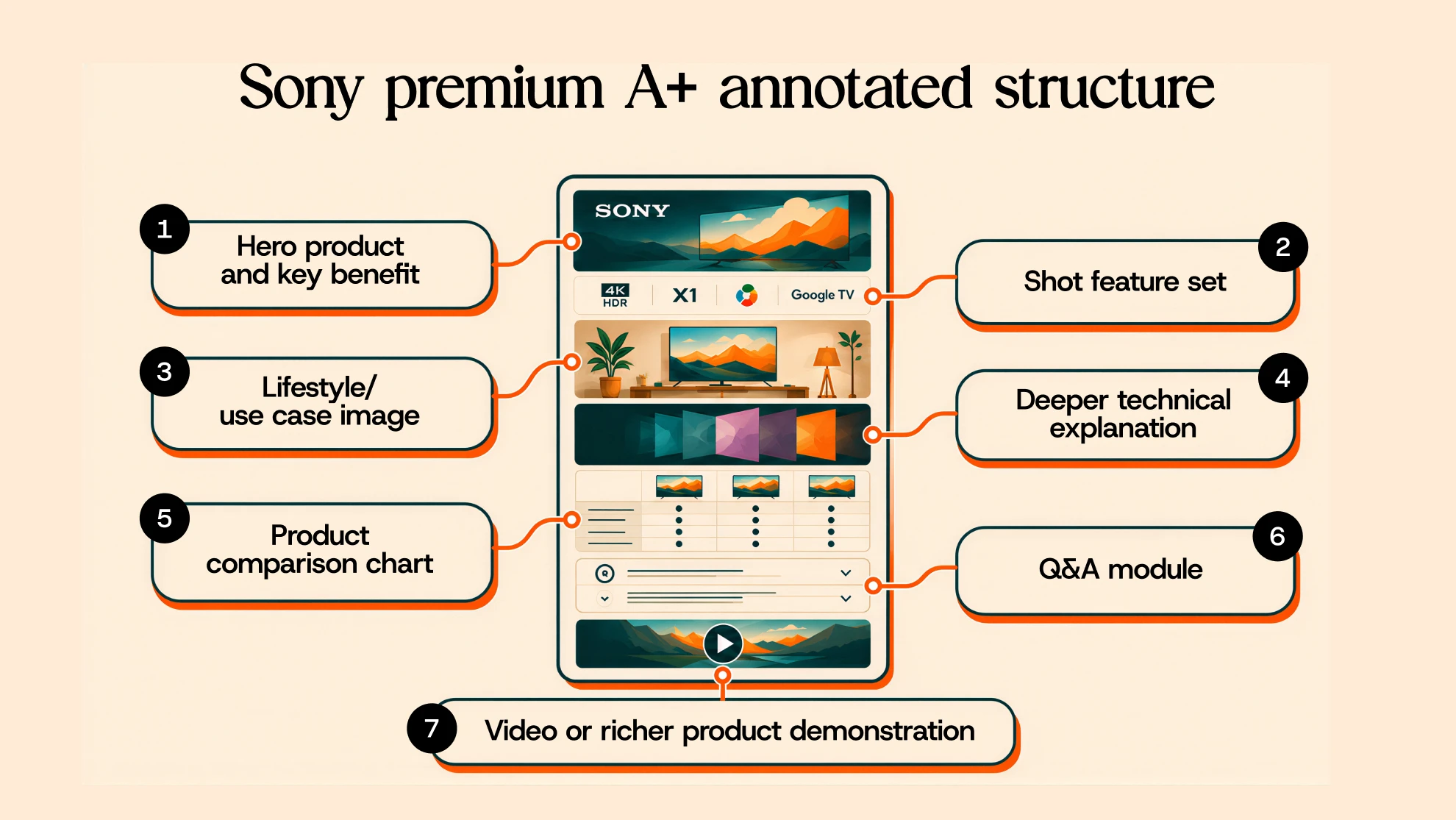
Do not copy blindly: A dog supplement does not need Sony’s page structure. Sony’s structure works because the buying decision is technical and comparative.
2. Jackery turns product selection into a buying guide
Category: Portable power stations
Shopper problem: The customer needs to choose the right model for a real-life use case.
A+ approach: Use-case context, specifications, FAQ, and comparison.
What to apply: Comparison charts should answer how shoppers actually choose.
Jackery has a similar problem to Sony, but in a different category.
A shopper looking at a portable power station needs to know what it can power, where it can be used, how long it lasts, and which model fits the intended use. Amazon includes Jackery in its A+ Content design guide, describing a page that combines brand context, lifestyle imagery, specifications, FAQs, and comparison.
The smart move is the sequence.
Jackery does not have to begin with a comparison chart. If the shopper does not yet understand the use case, a chart full of numbers may only make the decision heavier.
Lifestyle imagery can do the first job: camping, backup power, road trips, outdoor work, emergency use.
Then the specs and comparison modules can do the second job: which model fits that use case?
That is where many comparison charts go wrong. They list whatever fields were easiest to pull from the product sheet. A useful chart uses the criteria the shopper already has in their head: capacity, portability, charging speed, compatibility, runtime, or ideal use case.
Amazon allows comparison modules in Basic and Premium A+, but its current guidance prohibits comparing your product with competitors. Keep the chart inside your own product range.

What another brand can apply: If your product range has several similar models, do not make the shopper do the math. Build the comparison around the reason they are choosing.
3. Zesty Paws builds trust before it asks for the purchase
Category: Pet supplements
Shopper problem: The customer needs to believe the product is safe, credible, and worth giving to a pet.
A+ approach: Trust-building through palatability, efficacy, and safety.
What to apply: In trust-heavy categories, story alone is thin. Proof has to carry weight.
Pet supplements do not sell like portable power stations.
The shopper is not only choosing between models. They are deciding whether they are comfortable giving the product to their pet.
Zesty Paws describes its brand around three pillars: palatability, efficacy, and safety. Amazon’s Zesty Paws case study says A+ Content is one of the brand’s most important Amazon tools, and that Zesty Paws refreshes and rebuilds its A+ Content, including Brand Story, every year as part of “always-on optimization.”
Those three pillars are not fluffy brand language. They line up neatly with the shopper’s doubts.
Will my pet take it?
Will it work?
Is it safe enough?
That is the kind of logic an A+ page needs. The page should not simply say “trusted by pet parents” in a large font and call it proof.
If the product page uses imagery showing pets taking the product, ingredient or formulation information, benefit explanations, certifications, vet-related proof, or other approved substantiation, each module should be doing a specific job in that trust sequence.

What another brand can apply: In supplements, wellness, beauty, and personal care, the page should not only look credible. It should show what the credibility rests on.
4. Garden of Life uses Brand Story for product-family discovery
Category: Supplements
Shopper problem: The customer may want to understand the wider brand and related products.
A+ approach: Brand Story and portfolio navigation.
What to apply: Use Brand Story when the brand or product family changes the buying decision.
Not every product needs a founder story.
Sometimes the shopper does not care how the company started. They want to know whether the product solves the problem in front of them.
Garden of Life is useful because supplements often create adjacent needs. A shopper arriving on one product page may also care about related products in the range. Amazon’s Brand Story format can include product and Store links, which makes it useful for connecting the current ASIN to the wider portfolio. Amazon’s current A+ guidance describes Brand Story as a separate “From the brand” section that can work alongside A+ Content.
The important distinction: Brand Story should not do the same work as the product-level A+ modules.
A+ should help the shopper evaluate the ASIN in front of them.
Brand Story can explain the brand, organize the range, and make the next product easier to discover.
For Garden of Life, the value is not corporate storytelling for its own sake. It is helping the shopper understand how one product sits inside a broader supplement portfolio.

What another brand can apply: Use Brand Story when brand context or portfolio discovery changes the purchase. Do not make shoppers read corporate history because a module exists.
5. Kazi keeps the brand story consistent from ad click to product page
Category: Mission-led home goods
Shopper problem: The customer needs to understand why this brand is different from similar-looking alternatives.
A+ approach: Mission-led differentiation continued from Amazon Ads to A+ Content.
What to apply: The PDP should continue the reason the shopper clicked.
Kazi sells hand-woven home products made by artisans in Uganda, Rwanda, and Ghana, with a mission centered on fair employment.
This matters because the product’s meaning changes when the shopper understands the story behind it.
Amazon Ads says Kazi used Sponsored Brands image and video ads along with A+ Content to educate new audiences about its handmade products and fair-wage mission. The brand reported 350% higher Amazon sales than the previous year, and its best month in 2024 reached a return on ad spend of 4. Those results reflect Kazi’s broader product and Amazon Ads strategy, not a controlled A+ Content test, so do not credit A+ alone for the lift.
The lesson is still useful.
If the ad sells the product through the artisan story and fair-employment mission, the PDP cannot suddenly become a dry materials-and-dimensions page. The A+ Content should continue the same reason the shopper arrived.
That is not repetition. That is continuity.

What another brand can apply: If paid media creates the reason to click, the product page needs to prove that reason, not restart the conversation.
6. Uproot Clean uses video when still images cannot prove the product
Category: Pet hair removal
Shopper problem: The customer needs to see whether the product actually works.
A+ approach: Demonstration, carousel, Q&A, and comparison.
What to apply: Video earns its place when motion carries information a still image cannot.
Some products are difficult to believe until you see them in use.
A pet-hair removal tool is one of them.
Amazon’s A+ design guide highlights Uproot Clean as an example that starts with the frustration behind the product, then uses video and carousel content to show the product, followed by Q&A and comparison information.
That order works because the shopper already knows the problem. Anyone buying a pet-hair remover has met the enemy. The question is whether this tool can handle the surfaces and messes the shopper actually deals with.
Video gives the page proof that copy struggles to provide.
A sentence saying “removes stubborn pet hair” is easy to doubt. A clear demonstration across the right surfaces does more work.
The Q&A then handles edge cases. Does it work on this fabric? Is it safe for this surface? How do you clean it? Where should it not be used?
Those questions are not random. They often show up in reviews and customer questions. Mine the one-, two-, and three-star reviews as carefully as the glowing ones. They will tell you where the PDP is not answering enough.

What another brand can apply: Use video when the customer needs to see a function, movement, transformation, or texture before trusting the product.
7. Dokotoo uses motion to answer fit before sizing
Category: Apparel
Shopper problem: The customer needs to understand fit, movement, and size.
A+ approach: Video first, product details next, sizing after that.
What to apply: Apparel A+ should reduce uncertainty, not simply add styled images.
A flat apparel image can only do so much.
The shopper wants to know how the fabric falls, how the piece moves, how it looks on a person, and which size makes sense.
Amazon’s A+ design guide includes Dokotoo as an apparel example that leads with video showing the clothing being worn, then continues with feature imagery and sizing information.
That sequence makes sense.
Motion answers the first doubt: “How does this look in real life?”
Product details answer the next one: “What exactly am I buying?”
Sizing answers the practical one: “Will it fit me?”
If the page starts with another static lifestyle image, it may look pretty and still leave the shopper unsure.

What another brand can apply: Apparel A+ should use motion when fit and fabric behavior are part of the buying decision.
Recent Posts
Explore expert insights, creative strategies, and practical guides to help your brand create better content and scale faster.